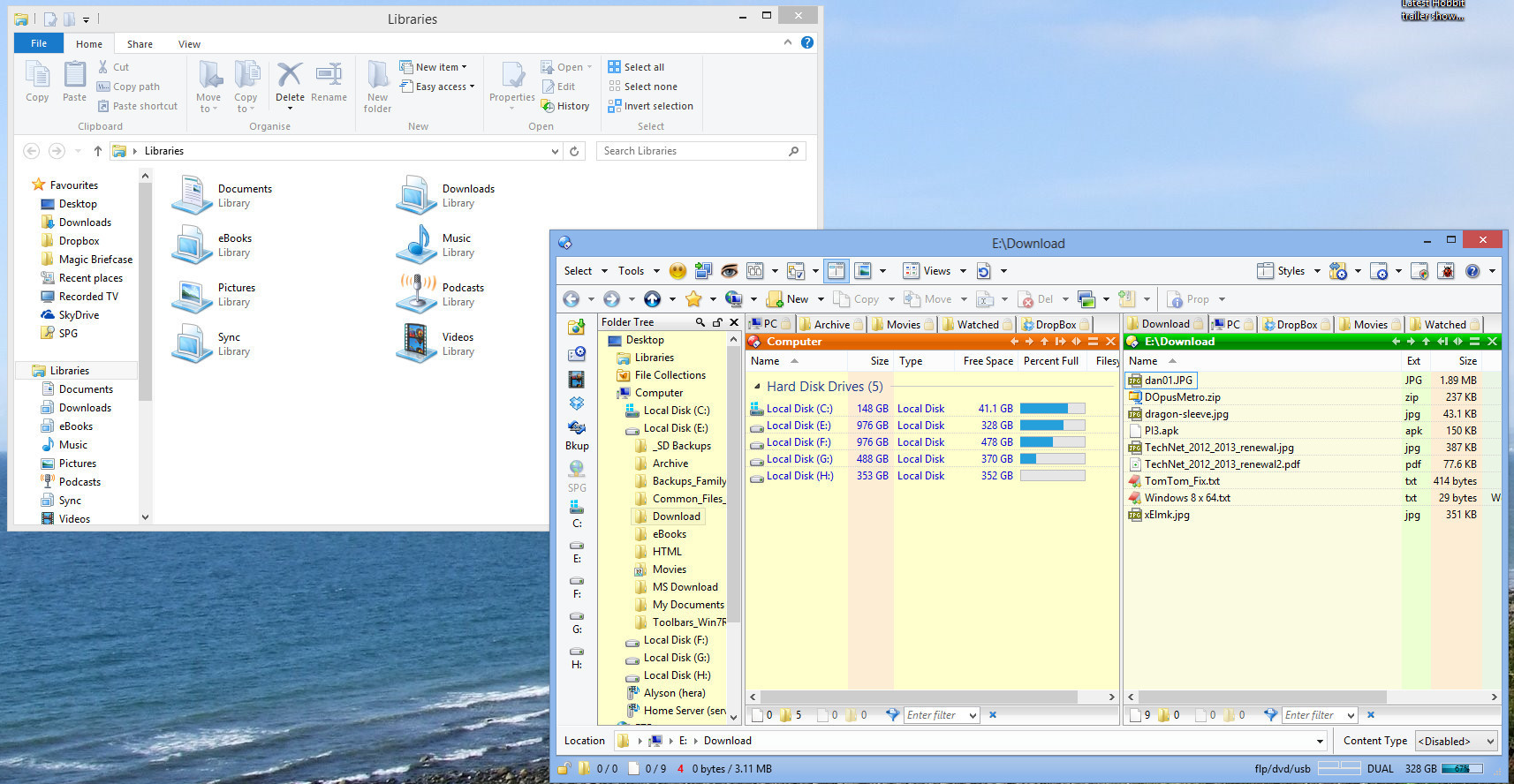
Well as much as I love DO under Windows 8 the Lister interfaced looks somewhat harsh compared to the native file explorer, the juncture lined between tabs etc look a little harsh and sharp.
So is there anything that can be done now, or will be done to make the interface prettier.
And yes I know functionality is all, but once does have to have a decent looking system interface
It was unchecked which was the recommendation for when I was using Windows 7 and comments on the tabs, but in Windows 8 it does look slightly better if checked.
So we are getting there, I guess that now to improve the 'flat' look I need to 'un-glass' the status bar 'space used' barchart from this:
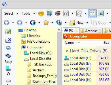
I too was a little unhappy with Opus's look under Windows 8, but with the tweaks mentioned here, it's no longer looking out of place.
Incidentally, I didn't expect Opus to be perfect out of the box on Windows 8, as it's technically not generally available until October. I'm currently using the 90 day evaluation to put it through its paces, till I decide whether I want to buy or not when it's released to consumers.
[quote="TheSeeker"]I too was a little unhappy with Opus's look under Windows 8, but with the tweaks mentioned here, it's no longer looking out of place.
[/quote]
Yes, your screenshot looks good!
You could also remove the separators between the buttons on the toolbar and replace the statusbar graph with this code:
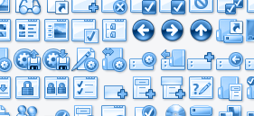
Thanks Cris. If there's one more thing I'd like to change, it's the look of the toolbar icons. I've just downloaded and imported your Metro icons and especially like the look of the blue set.
But Opus makes it easy to install another set of icons (for example the Metro set).
We now have 5 (!) complete sets:
Directory Opus 8 Icons by Trevor Morris
Directory Opus 9 Icons by Trevor Morris (included in Opus 10)
Directory Opus 10 Icons by me (default set included in Opus 10)
Directory Opus XP Icons (link in my signature)
Directory Opus Metro Icons (actually 3 sets - link in my signature)
[quote="Cris"]
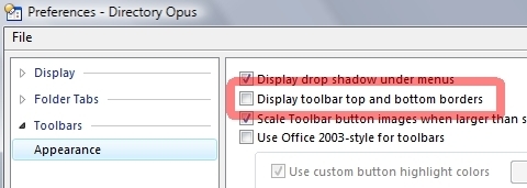
You could also hide the Folder Tree Header (still some harsh and sharp lines):
settings > preferences > folder tree > appearance > uncheck 'show folder tree header'[/quote]
Good suggestion, now done!
Now to get it spot on I guess for my own choice I'd need Opus to be altered slightly
The source and destination bar colours it'd be cool if they could share the colour from the visual style (dual lister mode) and use the active and inactive colours from the visual theme.
Hide the lines separating the vertical and horizontal toolbars
Have a windows 8 style folder tree (vertical open closes)
You mean just remove all the colors from the default set and/or give them one color?
Something like this can be done in less then a minute (actually, it's done already , see example below):