I suspect there is a way to set background color for buttons with a tag. If so, how?
Edit:<font bgcol="#cccccc"></font> This is limited to the font background and not the whole button.
Is the three-button tooltip that displays the mouse icons shown with one of these tags?
Any other tags etc missing from the list above you can share?
Thanks!
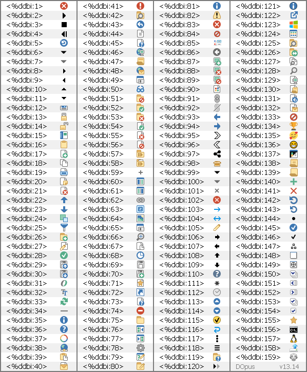
Reference for <%ddbi:xxx> (DOpus v13.14) Edit: Unfortunately I didn't include <%ddbi:0> it appears to be the same as <%ddbi:75>
Changing ddbi to ddbg will give you black and white version of icons.
Nice, but still very cryptic. There should be a color picker for the colors. For example, i would like to change the colors starting with light green (plenty of space) to red (critical), and also change the background color to something lighter. Only a suggestion.
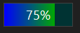
Wow, a progress bar can be placed in a button label. Wasn't expecting that one. Was hoping for a way to set the background color of a button conditionally with evaluator. Thanks for taking the time and sharing!
Are these useful icons/images somehow accessible from a script? Perhaps using DOpus.Loadimage?
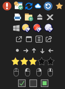
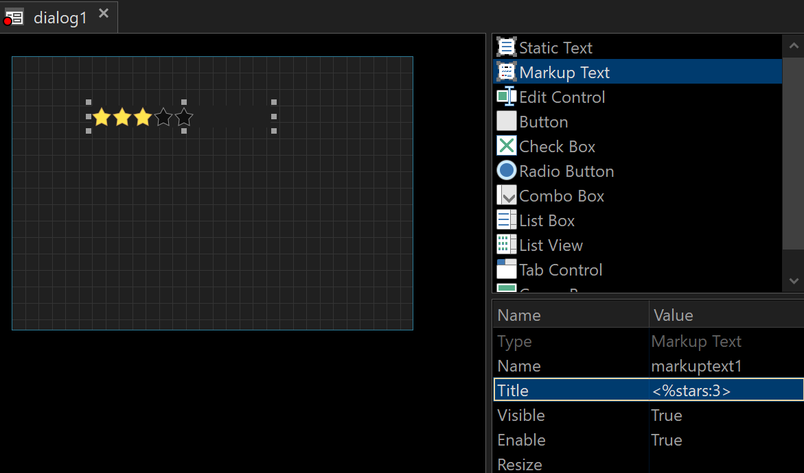
I am particularly interested in stars:0 through stars:5.
Any way to insert in a markup control the frame boxes that can be placed in the status bar?
I was looking at the possibilities that these new types of controls open up. They look good!!!
An example of what I want to use these frames for:
Here I'm using <kbd> for the frames, but you can see that they end up overlapping, plus if I want to use icons for and they end up splitting like this:
 and
and  they end up splitting like this: