I have Coverart.jpg in folders so that when in Thumbnails view it show a CD jewel case with the Coverart picture embedded in the Thumbnail view of the the CD cover. I wonder why the image quality of the original cover art is much better than the one that is displayed in the Thumbnails view?
I have the option of lossless compression in Thmbnails setting set to enabled. The images on the Thumbnails view are blurry comparing to the original cover art pictures. My coverart pictures are larger than the image size of the Thumbnails and even though they are larger they are much sharper than the ones embedded in the Thumbnails view. The thumbnails view is smaller than the Coverart picture so they should be sharper but it is the opposite.
Is it by design or there are some settings that can be adjusted to enhance the quality of the CD Jewel case view?
Could you paste a couple of screenshots showing the difference?
I can upload more pictures if you need then let me know.
The jewel case will lighten the image slightly, as the main area is not transparent but has a translucent plastic texture, so maybe that's what you're seeing.
It seems a bit extreme in this example though, which makes me wonder if the image is also using color profiles to make it darker than the source image data is on its own. (We probably ignore color profiles when generating the cd thumbnail, but I'd have to check.)
If Preferences / Miscellaneous / Advanced [Image Formats]: use_color_management is set to off, and you display the cover art using the Opus viewer or as a thumbnail of the jpg (not the folder), does it appear similarly bright?
You can also set Preferences / Miscellaneous / Advanced [Cosmetic]: no_folder_cd_thumbs to true to disable the jewel cases, if preferred.
The above is at it appear in Opus Viewer it is excellent... and it is when use_color_management is set to off
I don't want to disable the cover art cd Jewel case option because I really enjoy looking at the thumbnails while playing music. If possible it would be really nice if you can fix it so Jewel Case CD's will look sharper.

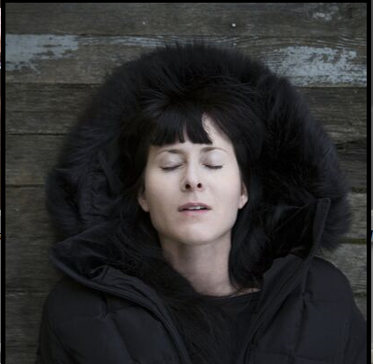
I am uploading the original coverart.jpg so you can check the color profile of the picture...CoverArt.zip (172.9 KB)
Leo,
Before writing the following I was comparing many coverart pictures vs. their Thumbnails view in Opus and there is an inherent reduction of quality in the program rendering the pictures on a CD Jewel Case, on some pictures in is more obvious and on some it is less. Even by using very basic programs to render pictures results in better representation of the picture in Windows.
Just to be clear that it has nothing to do with if the option use_color_management is set to ON or OFF.
Maybe I am more sensitive to pictures quality but if I look at Thumbnails views of pictures it manifest in Eye strain for me if I concentrate on the picture instead of casual gazing at them because they all look blurred.
If you are willing to revise your rendering algorithm to make it more accurate then all the pictures will look more vibrant bright and sharp relative to how it is shown now.
Thank you in advance for you considering my request.
Regards
It's just making the images brighter because it's blending the translucent plastic texture over them. It's a while since I looked at this but I think it didn't look good if the image was pasted as-is with just the CD frame around it.
I am sorry but I completely don't understand what you are saying could you please try to explain it differently.
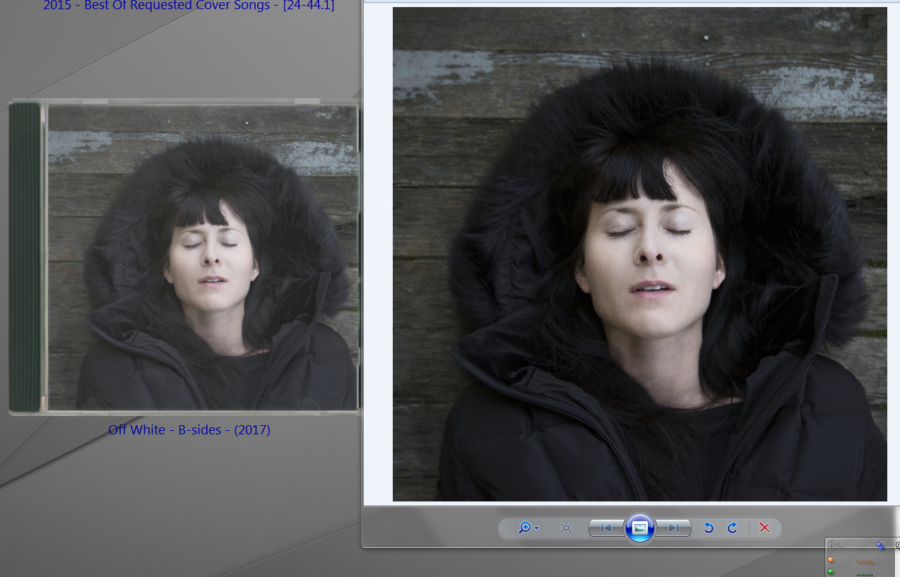
The images on the CD Jewel case are not brighter (they are White and Milky please look again at the picture that I uploaded which shows the Thumbnail and the original coverart picture) they looked like their resolution are reduced even comparing to the same coverart image which is larger but looks sharper than the CD Jewel Thumbnail.
Thanks
The CD cover art feature uses a scan of a real CD case, blended over the top of the thumbnail, to mimic the effect of a real CD cover (i.e. as if you're viewing the cover through plastic). If you don't like the effect you can disable it using the Preferences / Miscellaneous / Advanced: no_folder_cd_thumbs setting.
It was set to TRUE and now I change it to FALSE Opus restarted and it looks absolutely the same. Do I need to clean the Thumbnails cache after changing this setting?
This is after it is FALSE:

Give that a try, yes.
It does not help to clean the cache please look at this picture.
I used Autohotkey to display the cover art picture. Look how vibrant and sharp it looks comparing to the Thumbnails view:
That option should be set to true to disable the feature.
There's not much point continually reposting the same picture. We've explained why it looks how it looks, if you turn off the feature it will just look like a normal thumbnail.
It's really a wasting of my precious time to explain to you that I want it to look like CD jewel Box and not just normal Thumbnail (and your advice is to turn this off), hence the title of this topic. Why can't you just superimpose the picture in the box without using the semi transparency attribute of the PLASTIC and then it will look the same as the original picture. Or let the user have the option of how much the picture is blending in the plastic cover to change how opaque the picture should look.
And you think that I am in love with this picture and I am not really.
It seems that I am the only one who is having different preferences while looking at pictures. And since there is no one else who would like this feature (or bug) to behave differently than it is implemented now then you can remove this topic completely.
That's just how the jewel case feature works. If you don't like it you can turn it off but otherwise it works how it works 
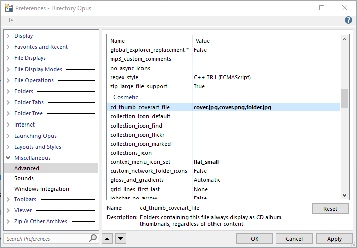
Just replying to this random coverart topic here, but is there a way to set multiple filename/types?
This does NOT seem to work:
I can fix that jewel case scan for you by the way. Although it is more realistic being semi-transparent. It might be interesting to have the option.
If options were to be added, I'd be interested to see an option to display it like LP covers, which would basically be the cover image with slightly softened edges and a gentle drop shadow. Even just the cover image is better than the classic folder thumbnail, but it'd be a small effort for me to create an overlay image.
You can only specify one filename there.
You probably wouldn't want to specify folder.jpg either, since lots of non-audio folders use that for other purposes.