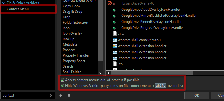
I have quite a lot of Opus commands/scripts in my context menu, because most functionality that I had in buttons which did something with a selected file, I have moved to File Types > All files > Context Menu. And I am, of course, using the option "Hide Windows & third-party items on the file context menus (Shift overrides)" :
But this still means that with Shift, it's a very long, convoluted context menu. Is there a possibility to show just one OR the other? E.g. a combination with the CTRL-key (or the Shift-key, differently set up in the options) would ONLY show the Windows & third-party items in the context menu, NOT the DOpus items. (Without a keypress it only shows the DO items, as I have it configured today) ?
Or, as a slightly less efficient but workeable alternative: could I add an entry ('button') in the Opus context menu itself that does such a switch? (Right now I can't think of a command or script that would do that - my knowledge of Opus is insufficient I guess).
In addition (yes, two topics in one, I know - but related) - would it be possible to have a 'splitter' option we can add in the context menu, so that content can be displayed at once but in two columns? This is of course a bit of a stretch, but in terms of overview in a long menu, it would be fantastic.
Yes I know that is an option. I have avoided it so far, because then I shouldn't have done the conversion from buttons in the first place.
OK forget it. An optimization for a fast and super-handy context menu is probably for no other users a priority. We'll see, that may change at some point in the future.
But if we would never suggest possible functional improvements we would be thinking less about possibilities that may perhaps one day make more sense than we thought.
My suggestion about a double panel for the context menu is one of those. Think of the typical Windows panel when you hit the windows key: long ago (e.g. Windows 7) it was just a scrollable list. Now its also a panel. If I could choose to split my context menu in two, even three or four parts, each of which (partially) filled with specific items that belong in col. 1, 2 or 3, 4, and this thing shows up all at once, that would be fantastic.
Do I like Opus less without it? Not really - I'm a grateful user. But maybe after a while some people will start thinking about it and say "hey, yeah that would be a great functional improvement, because most of us like it when we get a quick and complete view of basic tasks".
And there is only that much space you can stuff with taskbars - they take room that is better used for the lister and the tree and the viewer. Having more 'buttons' right under the mouse cursor makes sense to me - buttons that may mostly (but not necessarily) be used in relation to selected files or folders.
If you put the following code as a button at the top of the All files and folders context menu entries, all entries will be hidden when Shift is pressed,
A double panel (DO items separated from Windows items) would indeed be an improvement.
But IF the Opus team would do it, it would probably not be much work to extend that by adding the possitility to start a new panel to the right - perhaps in the same way perhaps as you can flag an item as the beginning of a submenu.
The existing Shift option would of course still be useful to include or not include the Windows items in the context menu.
You can put FileType CONTEXTMENU CONTEXTOPTIONS=windowsonly in a submenu in your custom context menu; that lets you get to the full Windows-only context menu without needing to press Shift. I can't think of a way to show a completely different menu with the Shift key down, currently.