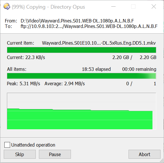
The file was uploading at over 5 MBytes/s, then the speed instantaneously dropped to some 23 KBytes/s.
I expected to see a sharp drop on the chart, but instead it started dropping very slightly and steadily over time.
I understand that using current speed for the chart can result in jittery line. But using overall average speed is unacceptable. If current speed is not an option, a one-second average could be used instead.
I'm basing this on memory and some old threads, so I may be wrong, but I don't think it is the overall average speed that it graphs, but a windowed average. Essentially, it smooths out small spikes in the graph. But that may be wrong, as I say.
I know this came up before and it is working as designed, but there was some debate about whether the design should change.
(We might revisit the graph one day and snaz it up, and maybe change this aspect as well, but personally, I don't see any utility from having the graph on and turn it off to make the dialog use less space, so it's a low priority for me, and I think Jon is happy with it as it already is.)
@Leo, as I said, if you need to smoothen the chart, you can use a one-second averaging window.
But using a very large window is meaningless (it's effing larger than the amount of time that fits in the visible area of the chart!!!).
Using a very large window is confusing, misleading and plain wrong. Current speed is 23 KB/s but the chart is showing the speed of 4000 MB/s that's slowly going down and will reach 3000 KB/s in 15 minutes.
THE CHART IS WRONG BY TWO ORDERS OF MAGNITUDE, DUDE! What kind of "design" is that?
Why would anyone even want to look at a chart displaying average speed difference over time? It's never gonna be much different from the displayed average speed value.
If you don't like the graph you can turn it off: Preferences / File Operations / Progress Indicators / Show speed graph in file copy progress indicators
(That's what I do myself! I'm not sure any argument about the utility of what the graph shows, or could show, makes sense as the graph is not going to be that useful for most file copies whatever it shows. What would you do with the information a graph displays, over and above the numeric values? Maybe it's useful for FTP transfers. But it's really just eye candy; something to look at while the copy is happening. I'd rather have a smaller copy dialog, so I turn it off. For diagnosing disk performance, the graphs in Task Manager or Resource Monitor give a better view and include all software accessing the disk.)