ooooooh, Cris, you are a tease 
Ooh when will we see them Chris?
Hmm after reading this thread I've changed over to the '2016' icons in v12.
I've tried 2016 and 2013 icons and I have to say 2013 (Directory Opus Basic) look fantastic on Windows 10! The updated ones should become default on flat Windows versions. 
Yes, the new icons in the current 12 beta are great. Especially the status icons.
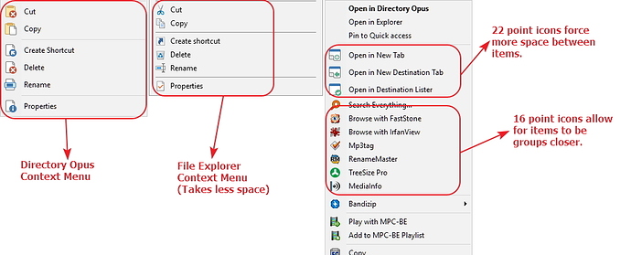
Could you make a 16x16 version of these icons for use in Context Menu items? Monitors are getting wider but not taller and vertical real estate is at a premium. As you can see from these screenshots the 22x22 icons make the context menu longer than it needs to be. My folder context menu is almost as tall as my 1920 x 1080 monitor.
If we had 16x16 icons we could have context menus in Dopus that look the same as context menus from other Windows applications.
Also some users, possibly myself included may like to replace the 22 point icons with 16 point icons throughout Dopus. It would give you shorter toolbars and more space for the file/folder window.
Thanks
It's a nice idea, but quite a lot of work to create 278 16x16 icons ... I will see what i can do ...
That works for me. Also, I noticed the old Dopus 8 icons are 20x20. So I might have been wrong about the correct smaller size. So I'm just going to ask for smaller and let you figure out the right size. Thanks.
Leo posted a 16x16 icon set that works well if you want the smaller icons.
