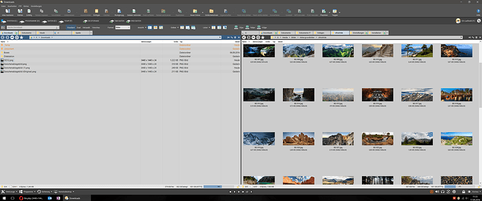
Nothing special, just a snapshot to inspire...
Thanks for the inspiration! o)
I like the greyish background for the thumbnails on the right hand side, I tried to setup just this (not messing with other colors and things) but noticed, that I cannot have a grey background for just thumbnails view. It would always effect details mode as well, which I'd prefer to stay light and white. My attempt was to set the background color for the "Images" folder format to grey.
It seems DO would need to support different background colors for the tabs and wether it is in thumbnail or details mode, but maybe you or someone else knows a trick? Thx! o)
You could use the folder formats system (i.e. favorite formats) to switch view modes and change the background colour at the same time. Maybe we should add mode-specific settings to main Preferences though (or add a command to allow colors to be changed via scripts). All good ideas for the future o)
Thanks Jon, so you confirm my findings. I see how a separate format, which I set manually, would solve the background issue, but then I lose the automatic format switching I guess, so maybe I better wait for the future and try again. o)
Looks beautiful, thanks for the inspiration!
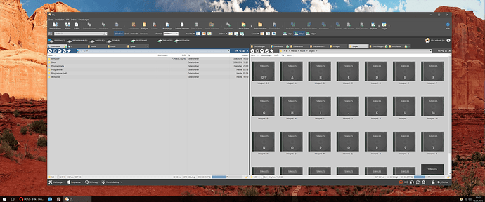
Thanks. Here's an update (the dark design is new to me, so it's not final  ):
):
And here are the backdrops used in the toolbars:
Backdrops.zip (1.67 KB)
If your music collection is just as tidy and sorted as it suggests from the screenshot, could you upload that as well? o))
You won't believe... it is!
Sorry, tried to upload, but exceeded size 
Damn! Thanks nonetheless! o)

