M00shi DarK Kompact

Hi there...

im new to DO... discovered it 2 days ago...

that thing is super complex, but it doesnt have to be... personally i hate it.
dont like seeing all year round something i might use once a year and having 5 ways to do the exact same thing.
for me its about screen real estate, simplicity and actually getting things done and fast.

i mean its a file explorer... its supposed to allow you to do stuff with files... its not a control center to land stuff on the moon.

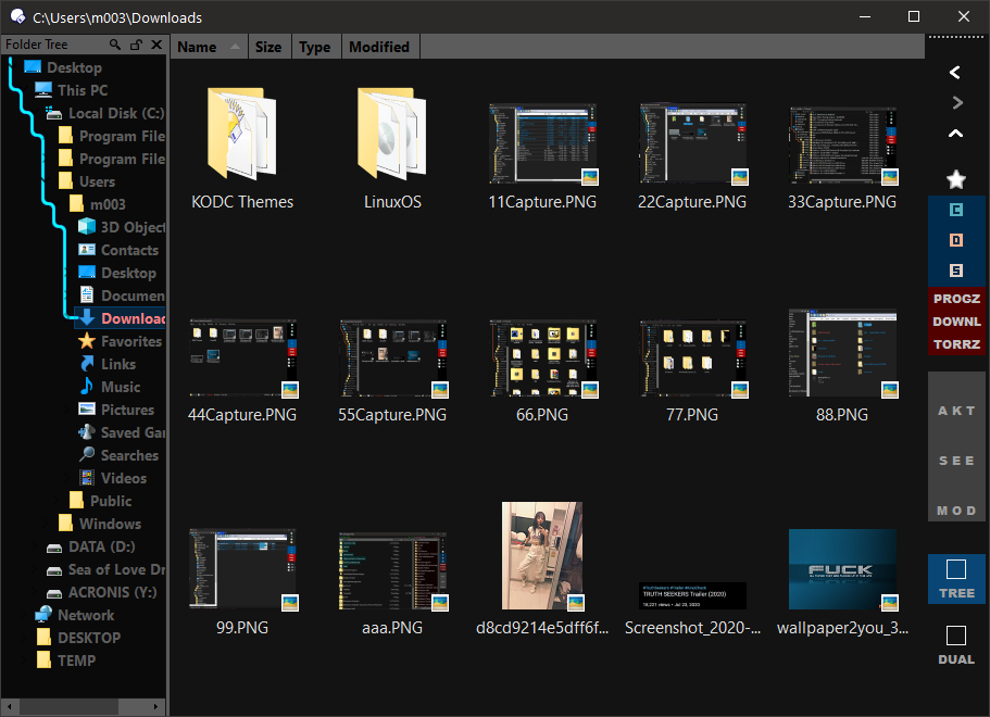
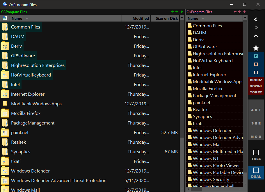
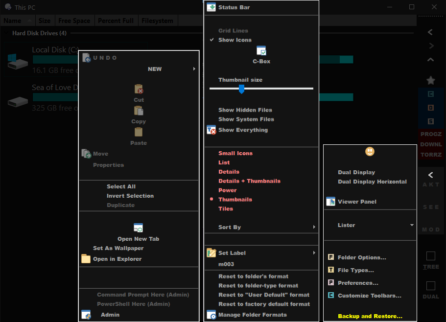
so i've made myself a super compact layout . ocb...
almost 90% of all DO function are there in 3 menus.
AKT: stuff you act on...
SEE: how you see things...
MOD: related to DO settings...

  • Direct access to "favorites list", "3 drives", "my 3 most accessed folders", "tree and dual panel mode"

some screenshots:


feel free to downl the .OCB and try it...

:warning: Warning: :warning:

The download is a full Configuration Backup (.ocb file), not a theme (.dlt file).

Unlike themes (.dlt files), configuration backups replace your entire configuration. Installing a configuration backup will change every single Opus setting, and all your toolbars, folder formats, etc., to the ones saved in the file by the author.

If you only want to affect visual settings then do not install configuration backups; only install actual theme files (.dlt).

If you install the .ocb file be sure to backup your own configuration first so that you can go back to it. Use Settings -> Backup & Restore to create a backup of your configuration.

m00shi DarK.ocb (2.6 MB)

...
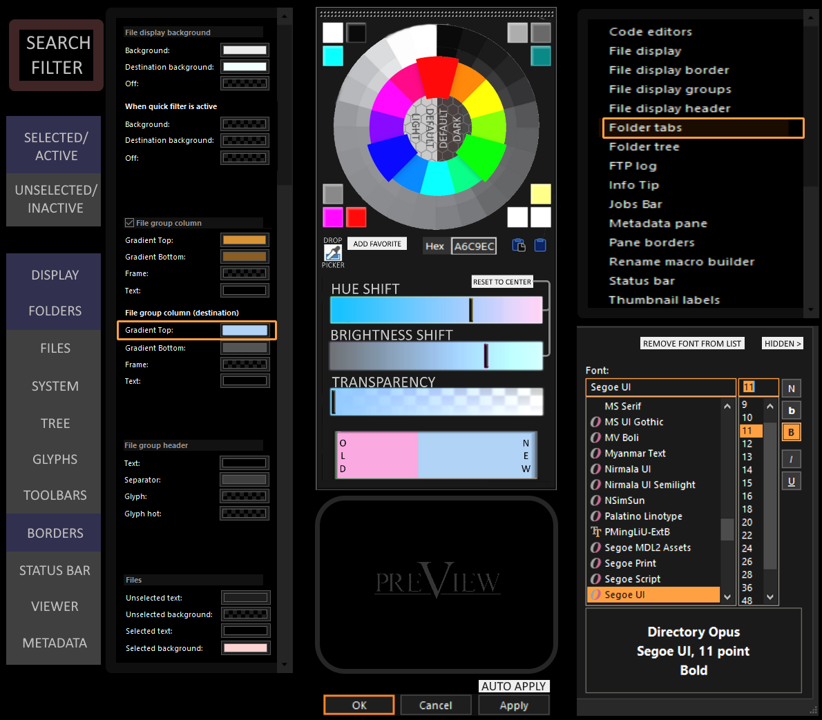
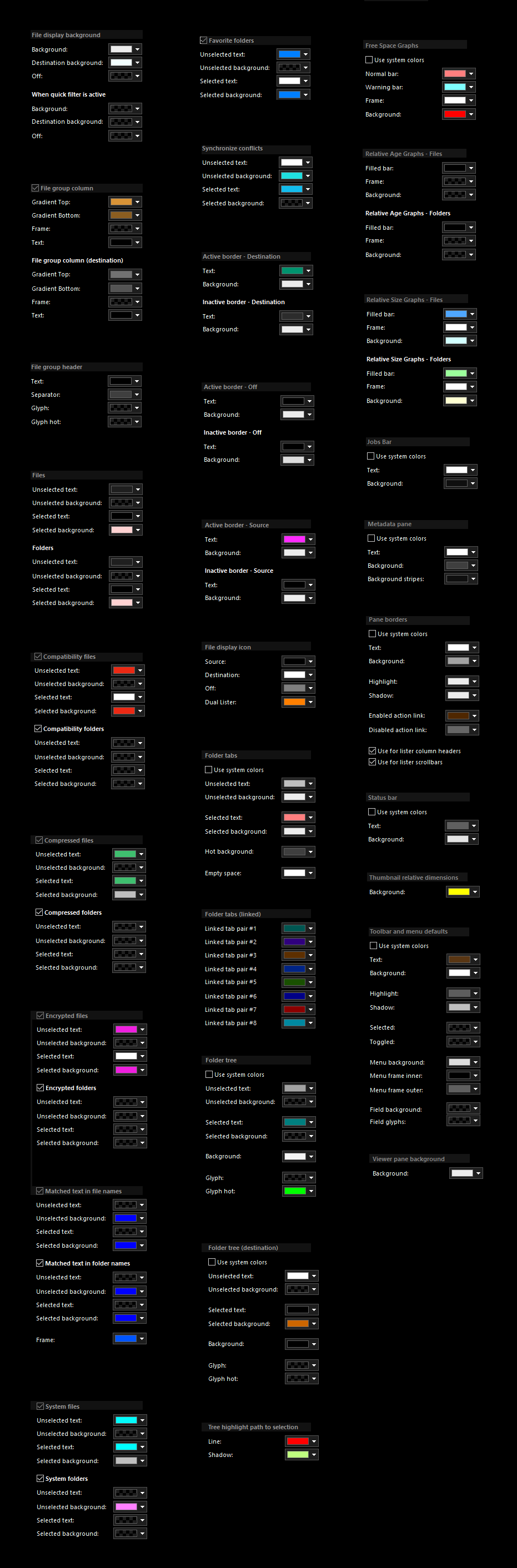
one word to GP software:
Great software guys, but for the love of god, clean up your menus, its a mess... ...these 232++ tabs and menus could be in 9 pages... theres litterally 53 pages regarding colors and fonts, SERIOUSLY!!!...
... and not way to put these dark while im spinning around hours in them... :frowning:
its the way you name stuff and located them.. nothing is clear.. 85% of all i did was searching where that thing was... and forgot where it was 10 minutes later... lol
theres still 15 "should be simple" things i wanna do and still dont got a clue how to do it, and its not because i didnt look for it thoroughly...
(i dont know put some popup image or mouse over next to most buttons visually showing what it is and where it affects... common stuff larger, etc...and 2-3 10 minutes videos might not be a bad idea)

:wink:

1 Like

The thing is that your idea of what's essential is not the same as everyone else's, and we either produce a very simple default config which can do almost nothing (and makes most people wonder what the point of Opus is, or complain that they have to do work to add any extra functionality) or we make one where you may run into menu items you don't personally use and may want to remove.

I think the default toolbars and menus strike a good balance, and categorise things so if you aren't looking for e.g. a special way to copy or rename a file then you won't run into commands for that, but if you are looking for that then they're in an obvious place.

Opus is configurable so if you don't use something you're free to remove it, and can make the perfect toolbars and menus for yourself. But remember that not everyone else is you.

I could point to several threads of people complaining that there isn't enough in the menus and asking why every possible command isn't in the default menus. (Which would be impossible as an infinite number of commands could be made. It gets silly at both extremes.)

3 Likes

Hi Leo... you clearly misunderstood me... i never said that DO was too complex... i could easily agree that its not complex enough.

what i said is that "i like my" interface to be simple... and yes this as only to do with me... if you like this layout Great if not thats Great too.

my point is that THE WAY the menus are set-up is non-sense complex for nothing, and i really dont think theres much to argue on that.

-y

I disagree, but if you have suggestions about better ways to organise them, please let us know!

1 Like

Well... here for a start... i've just crushed over 60 confusing pages into a clear 1... added functionality and a lot more stuff from elsewhere can be incorporated here... gotta be cleaned, but you got the idea.

All this stuff goes here with search filters....

Preview area is just a visual representation (black and white faded and 1-2 colors) of what you are actually affecting...
(i've added a real time change apply option as well if possible)

overall, its clean, clear, direct-to-the-point, not fully text based "gotta re-read everything every time", no sub-menus or constant pop-ups.
_

1 Like

It's umm... interesting, I'll say that.

2 Likes

LOL... :wink:

all the other functions and menus can be re-thought similarly regarding classification... i just feel like im reading a dictionary and constantly searching stuff when im working on that.

Another idea... i think the program itself and the customizer should be 2 different programs... one opening to modify the other when needed... making the program itself smaller, faster and more stable (mine is crashing twice daily so far and i've got an i5 clean AF).

_

How curious. My DOpus hasn't crashed in, well, I honestly don't know how long. I suspect that's something the developers can help you figure out. If you link your account, I'm sure they'll be happy to help you with that problem.

Crashes are almost always caused by things like third party shell extensions or video codecs. But if they are caused by our code we would like to fix them. See the FAQs for help on crashes and how to track down where the problem is, depending on the nature of it.

Please start a new thread with details of what you find if you want help with that.

ya.. thats fine... crashes only when i customize stuff.. it frozes every else as well, gotta task manage it.