-
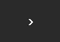
The arrow cursor for switching pictures is too solid and fat.
This is what I expected.

-
Checking Show picture Information in the right-click menu will not be remembered the next time you open it.
-
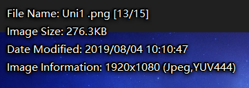
In full-screen mode, I like to display subtitle-style picture information at the middle bottom of the screen. I think this is the habit of many people.
-
I recommend integrating this script.
Viewer Select - Make file display track standalone viewer
Enhancing the user experience.
1 Like
Yes, it's a bit clunky. Why not have a setting in Miscellaneous viewer arrow = bold|light?
-
Would be too hard to see over many images. Only shows up when the mouse is along the sides (if the option is on), so being visible matters far more than being small.
-
It’s temporary by design. You could have a script turn it on every time but I think it would get in the way of seeing the image sometimes? The viewer’s Metadata panel is another alternative.
-
Example screenshot?
-
Already built-in with Lister-Linked viewers in Opus 13. (Turn on the option for two-way linking.)
-
There is actually no need to show the arrow cursor because we can set the area, at least the color is too white.
-
This is not important, just by the way.
-
This is a screenshot of Honeyview.
-
Great, I misunderstood the button name. . .
looks good to me, needs a contrasting outline on it to make it more visible.
+1 on that, an option to have this always on please.
can use this to always enable lister-linking
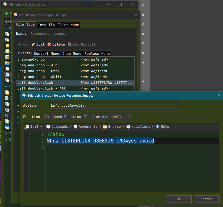
It already has one. ![]()
If this can be implemented, make it customizable? Then there is no need for the second one.
Thanks @galaxyhub, now I know howto use lister-link