Maybe this was added at some point, so I'm asking here.
It's possible to add icons to buttons in a dialog, but is there any way to use Opus' internal icons?
As a workaround I use markup controls where they can be referenced (eg. using <%ddbi:xyz>), but maybe button controls already support this.
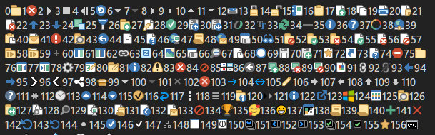
Yes, with icon name like #icon_name, and you can also force the icon set prefixing with icon_set:. When forcing icon set, I don't remember where the dash has to be put (very beginning or after : )
Edit: example here CommonLogger : A logger for Opus (js) scripting
We'll add a way to do this in the next beta.
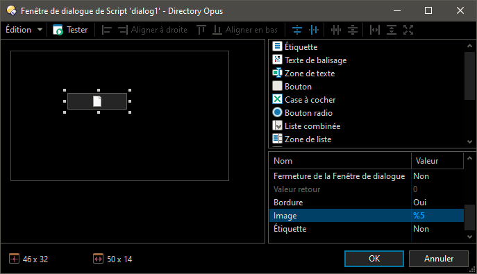
The icon is not visible in that panel. Try previewing it with the Test button, or with the dialog in actual usage.
We'll make the dialog editor show the proper icon in the next update.
Hi.
Currently, % is equivalent to using the code <%ddbi>.
Could you add a way to also access the equivalent icon <%ddbg> (same icon but in grayscale)?
So it is possible to emulate a button with an on/off state.
In the next update you'll be able to use %gx (e.g. %g32) for greyscale.