We're planning an overhaul of the themes system which will include automatic backups of your previous settings. (Probably not in the very near future, as it's behind a lot of other higher priority work, but it's something we've been working on in the background for a while.)
10 Likes
Good to know, thanks.
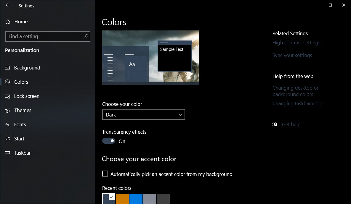
I really like how the text is so clear with a dark theme. Great stuff.
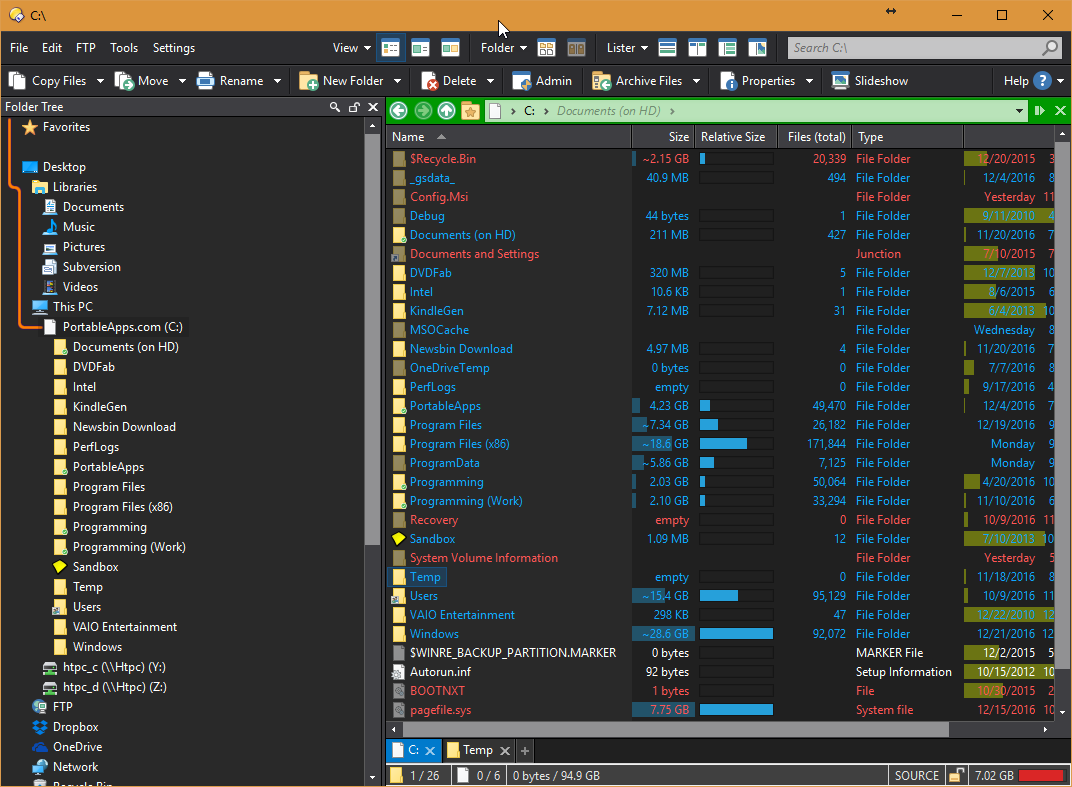
Can you please make the dropdown (to open a folder, in the left panel) a lighter colour, as its very hard to see the icon.
Thanks
Thanks a lot for this. Not sure how to make those connecting lines between folders work but it looks beautiful. Happy new year, friends!
Cheers
To enable connecting lines in folder tree:
Go to 'Settings > Preferences > Folder Tree > Appearance'. Check 'Highlight path to selected folder' and any sub items as you see fit.
1 Like
You can change the color of the drop down icon with the 'Settings > Prefs > Display > Colors and Fonts > Other Colors' options 'File display border - dest' and 'File display border - source' text colors. However, looks like the default white is actually applied with a mask to the background color, so white is just a lighter variant of the background (so it appears light green/orange). What you can do is change the background color to be something darker to increase the contrast, or make the text color darker (black?) to increase the contrast.
Hi, I love this theme. Is there a way for me to make the very top bar of Directory Opus a lighter shade than white? I understand this may be an OS problem, but I see your screenshot above your titlebar (for the main opus app) is Orange. Mine is white and can't find how to set it. THanks!
In Opus 13, it'll also use the Windows dark titlebar colors (usually black or dark grey for the inactive window) automatically if set to dark mode.