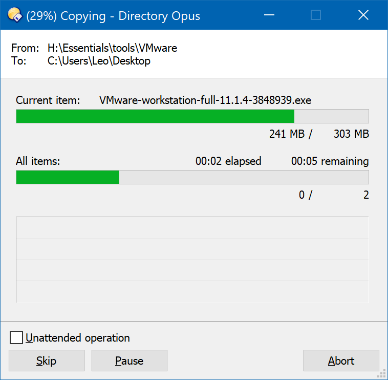
Back when DO10 came out I posted on here and submitted a request to enlarge or give us the option to change that ridiculously small font in the copy progress dialog. Nearly 3 years later and after other users have posted and created threads asking for the same thing, DO10 and now I see DO11 still use this tiny font for no good reason, there's plenty of room to make the font size a bit bigger without affecting the look/layout of the box.
My simple question is: Will it be made a bit bigger or will there be an option to change this in the final release of Opus11???
We may add it in the future but have no immediate plan to.
We don't consider it to be broken, but equally have nothing against an option to change the font size for those who don't like it. It's just a matter of limited time and priorities.
I contacted GP Software about this exact issue nearly 3 years ago when the reply was "we'll look into it and see what we can do", so forgive me if I don't find you response very comforting...
I appreciate time is tight for you guys but by the same token this is an issue that has been raised before and not just by me but several other users too. I don't necessarily call it broken either, because the function works, but it is a problem when you make parts of the interface harder to read than before for no real reason, and we can't do anything to change it. Either enlarging the font so it matches the other font in the window or having a font preference would be good.
I'll keep my fingers and everything else crossed this gets looked at a bit sooner than another 3 years....
I would like to add my voice to those of the other; with so many other preference options, why not a group of options regarding dialogs? It just seems inconsistent to have so much control over the appearance of files and folders and listers, and then have to squint to see the type in the preferences dialog itself.
I'm going to jump on this train and ask, again, to make the Name: and Tip: edit boxes re-sizable, for people who need verbose descriptions due to possibly memory problems...
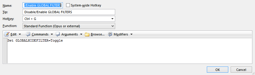
Not sure what that has to do with this thread, but you can put comments into the command itself (where the "Set GLOBALHIDEFILTER=Toggle" line is in your screenshot) by prefixing them with // if you need to leave verbose notes to yourself for later.
Ok, it's 6 years later and due to technological advances this is more of a problem than ever, The fonts are ridiculous on a 4k monitor, the dialog boxes don't even respond to windows scaling. I am registered partially sighted and a (guess) 8 point font on a screen that's 3840x2160 is impossible to read. This applies to all the dialogs, copy, move makedir, rename etc.
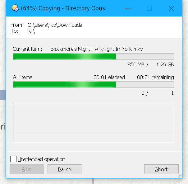
(I think this thread was about a different, older copy dialog in Opus 11 where some of the less important numbers used a smaller font. That's no longer the case in Opus 12. The issue it was about no longer exists.)
The dialogs do respond to scaling, and the fonts should be the same size on any monitor, 4K or otherwise, provided the OS's DPI scaling is configured properly and not being overridden.
If the fonts are really small, as in half the size you expect them to be, then there is a DPI override in effect via Windows compatibility settings applied to dopus.exe. You want all overrides turned off. See Windows Compatibility Settings / Wrong DPI / Installer misdetects OS for more detail.
We'll be making them fully configurable in the future, as well as defaulting them to the newer standard 9pt size rather than the older standard 8pt size which Windows used to use. But they should already be a readable size unless something is misconfigured in the OS DPI settings or compatibility overrides.
Thanks for the quick reply, I use a windows scaling of 150%, I feel that using 200% on 4k is pointless, you might as well use a far cheaper 1080p monitor at 100%.
No compatibility options are set. It probably doesn't help that I'm a long time user of Dopus 5 (since it's release and still use it now on OS4) so am used to being able to set all GUI elements.
Great to hear you're still planning to make it configurable, hope it doesn't take another 6 years.
Not the case at all. Everything is much clearer and better looking in 4K 200% compared to 1080p 100%, and you get more space because the borders around things are half the size (still 1 pixel thick) even if the fonts are a similar size.
Of course, it really depends how far away you are from the screen. But having more space isn't the only reason to have more resolution.
The fonts in your screenshot for the dialog titlebar (which comes from Windows) and the dialog itself don't look like they are vastly different sizes. If you can read one, the other should be readable. The fonts themselves look strange to me, though (very thin, quite angular, and not antialiased in the normal way), but maybe they've been changed from the system defaults? Could also be the image has been scaled in some way.
You'll be able to configure the dialog font in the future if you want it larger, or to use a different face, in any case.