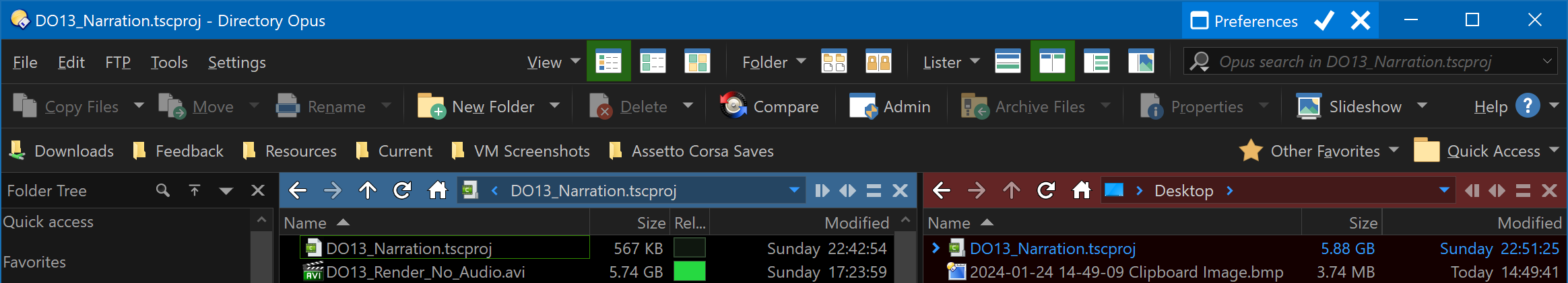
In Opus 13, we changed the style of the built-in navigation icons (back, forward and parent/up):
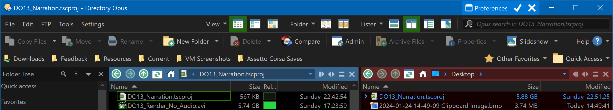
If you preferred the Opus 12 style, here's an icon set which brings that back:
To install:
- Download: Navigation Icons - Opus 12 Style.dis (13.4 KB)
- Drag it to Preferences / Toolbars / Icons.
- Move it to the top of the list (so it overrides the other icons).
- Click OK or Apply.
Alternatively, if you prefer the Opus 13 style but want to recolor them, here is an icon set you can use as a template for doing that. (You could also use these with Opus 12 to get the new style, if you want.)
- Navigation Icons - White.dis (11.8 KB)
A .dis icon set is really a .zip file, so you can rename the extension to look inside them and edit the icons as needed.
Both sets contain images and XML for DPI scaling and size selection consistent with the built-in icons.
Example file content:
-
Navigation Icons - Opus 12 Style
64.png
48.png
32.png
22.png
-
Navigation Icons - White
64.png
48.png
32.png
22.png
Navigation Icons - White.xml
<?xml version="1.0" encoding="UTF-8"?>
<iconset name="nav_example_white">
	<display_name>Navigation Icons - White Example</display_name>
	<copyright>(c) 2023 GPSoftware</copyright>
	<artist>Leo Davidson</artist>
	<set filename="22.png" size="small" width="22" height="22">
		<dpi base="100">
			<scale factor="100" filename="22.png" width="22" height="22" no_scale_min="0" no_scale_max="125" />
			<scale factor="150" filename="32.png" width="32" height="32" no_scale_min="126" no_scale_max="175" />
			<scale factor="200" filename="48.png" width="48" height="48" />
			<scale factor="300" filename="64.png" width="64" height="64" />
		</dpi>
		<icon row="1" col="1" name="goback" />
		<icon row="1" col="2" name="goforward" />
		<icon row="1" col="3" name="goup" />
		<icon row="1" col="4" name="refresh" />
		<icon row="1" col="5" name="home" />
	</set>
	<set filename="32.png" size="large" width="32" height="32">
		<dpi base="100">
			<scale factor="100" filename="32.png" width="32" height="32" no_scale_min="0" no_scale_max="125" />
			<scale factor="150" filename="48.png" width="48" height="48" no_scale_min="126" no_scale_max="175" />
			<scale factor="200" filename="64.png" width="64" height="64" />
		</dpi>
		<icon row="1" col="1" name="goback" />
		<icon row="1" col="2" name="goforward" />
		<icon row="1" col="3" name="goup" />
		<icon row="1" col="4" name="refresh" />
		<icon row="1" col="5" name="home" />
	</set>
</iconset>