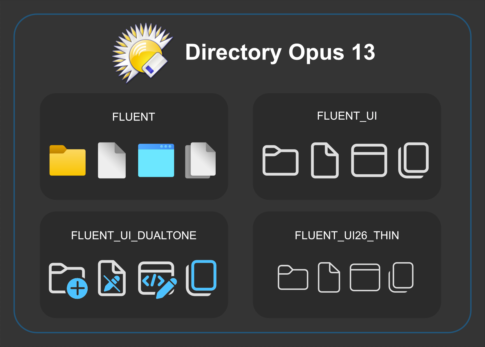
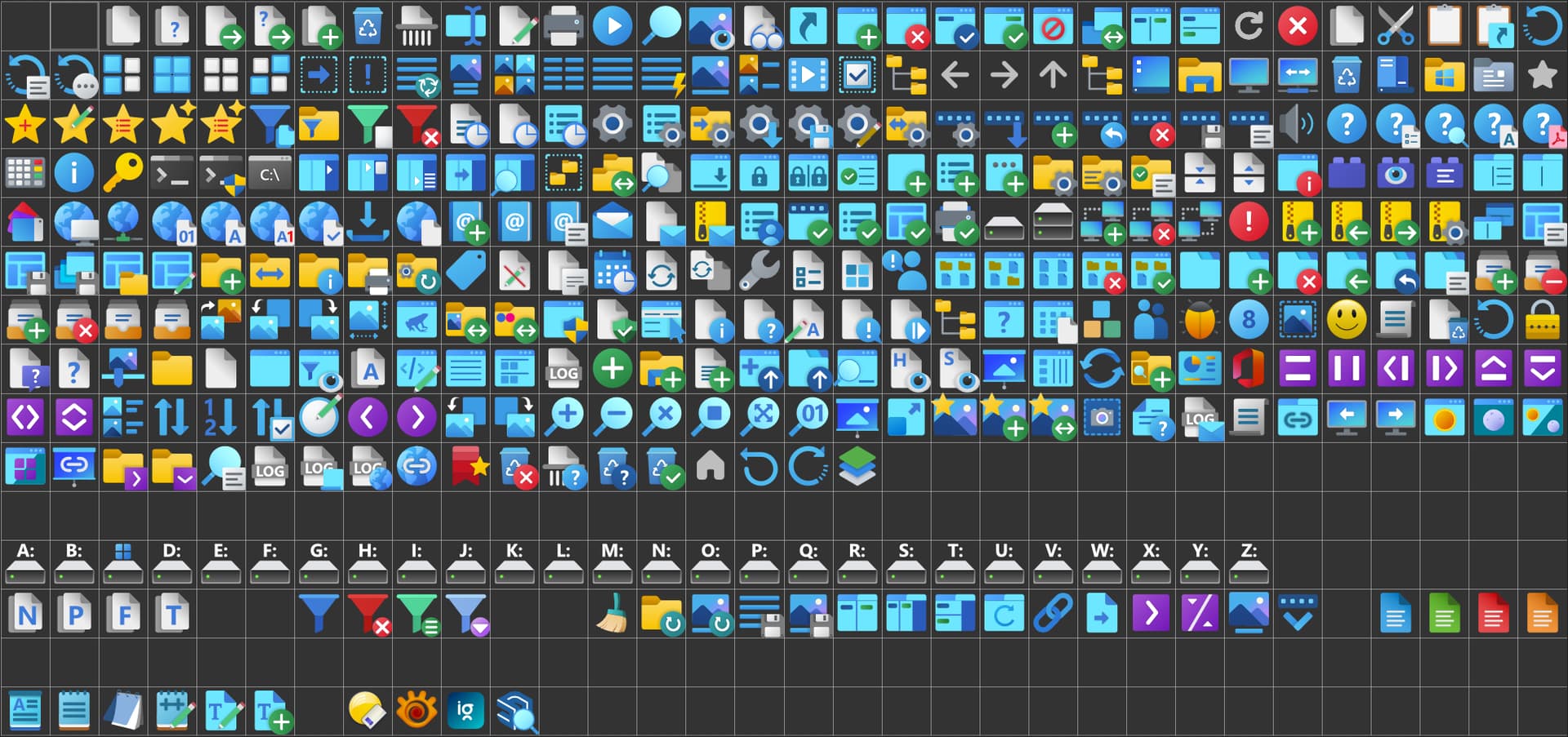
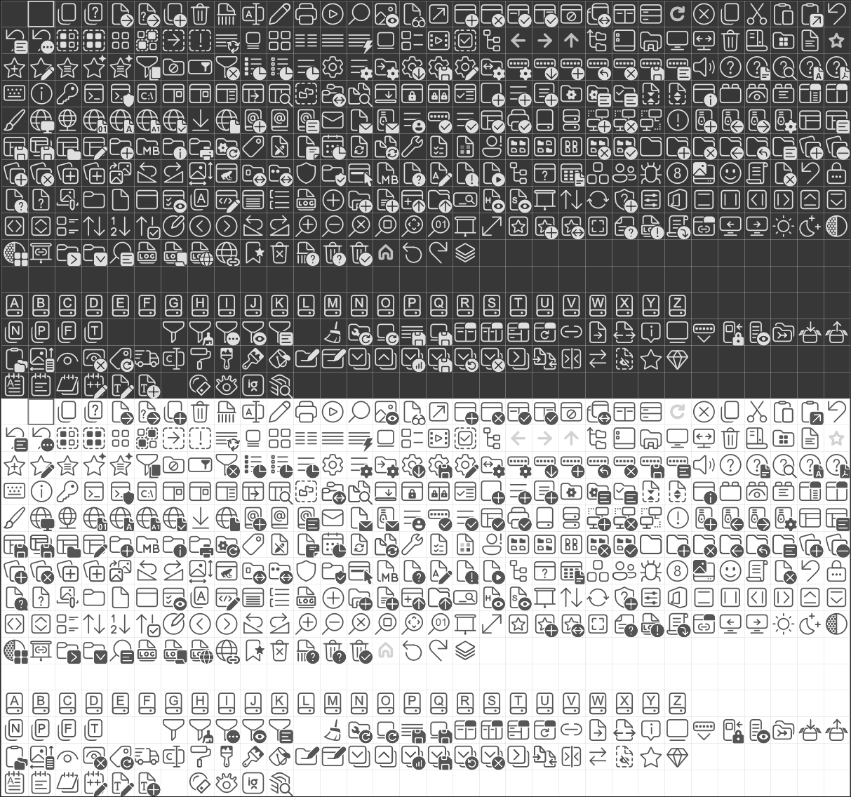
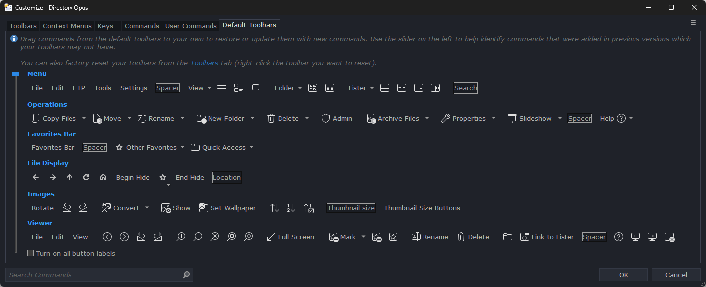
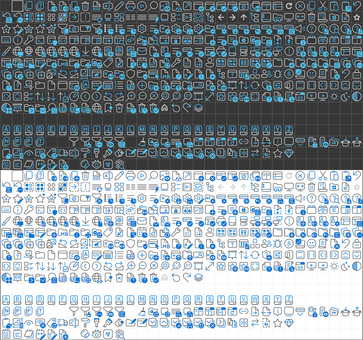
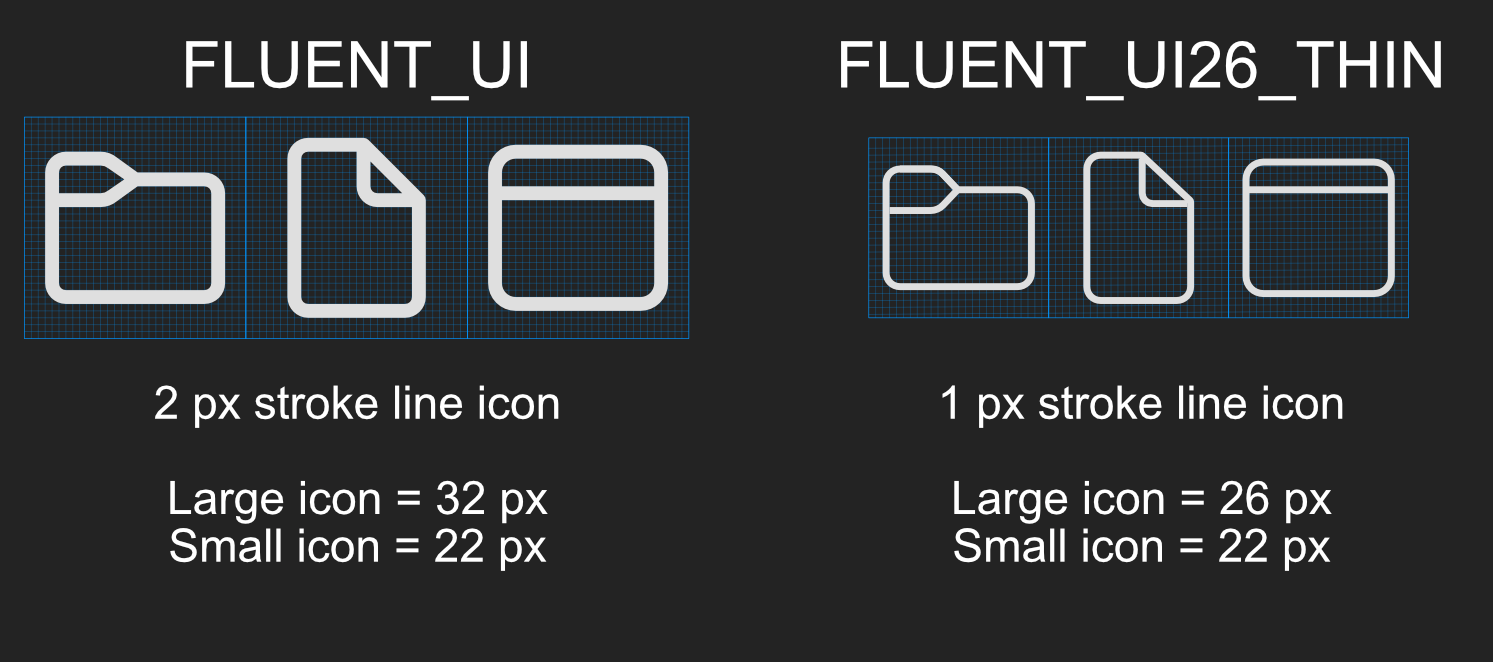
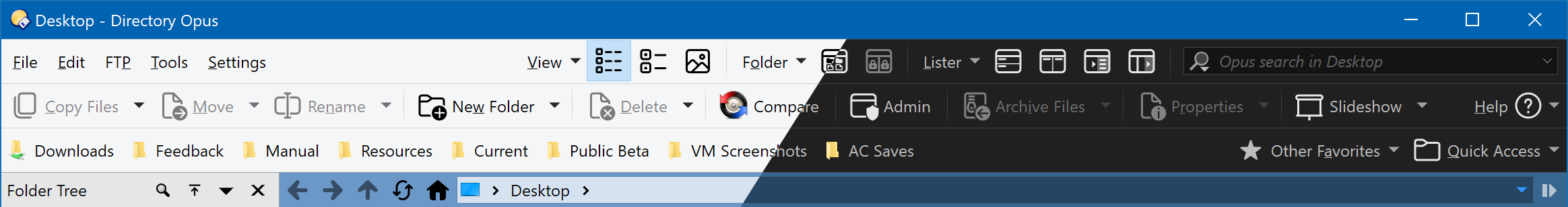
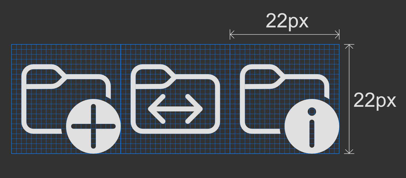
I created several icon sets in the Windows 11 "Fluent" style. All icons were created at 22 px (pixel perfect) and 32 px (pixel perfect) except "FLUENT_UI26_THIN" created at 22 px (pixel perfect) and 26 px (pixel perfect).
Fluent Icon Set:
Update August 15, 2025:
--Some icon styles are more in line with the default icon style in Windows 11.
It's up to you if you want to change the original/definitive set to work the same way. It does make startup a bit slower, as there are more icons to load, but only a fraction of a second.
@skinz the monotone are really something. Many thanks!
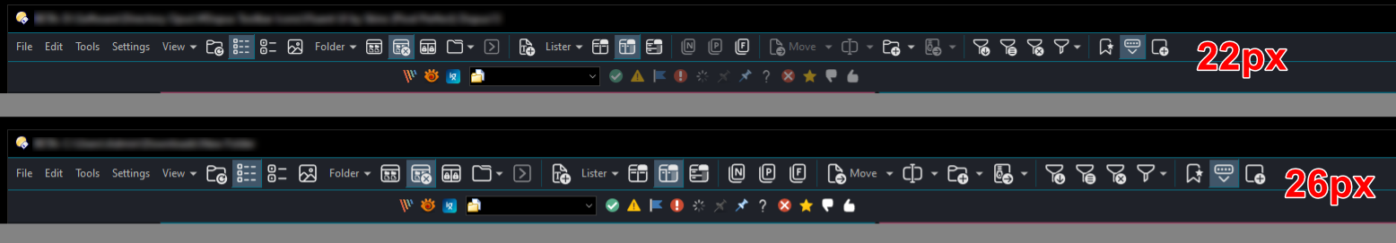
If you have time to spare, could you consider making a variation where the small icons are slightly larger (e.g. 25px or 26px)?
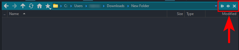
was wondering would it be possible to fix the "Go Forward" and "Go Back" icons to be consistent with the other icons (they are light grey which is very low contrast in light mode, but looks perfect in dark mode)
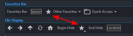
I don't use them, but there are a couple of other icons with this problem too: Favorites, Home, and Refresh
If I change the icon color to black, the result will not be balanced with the default dopus icon. All the icons you mentioned are only for the File Display bar except the favorites icon.
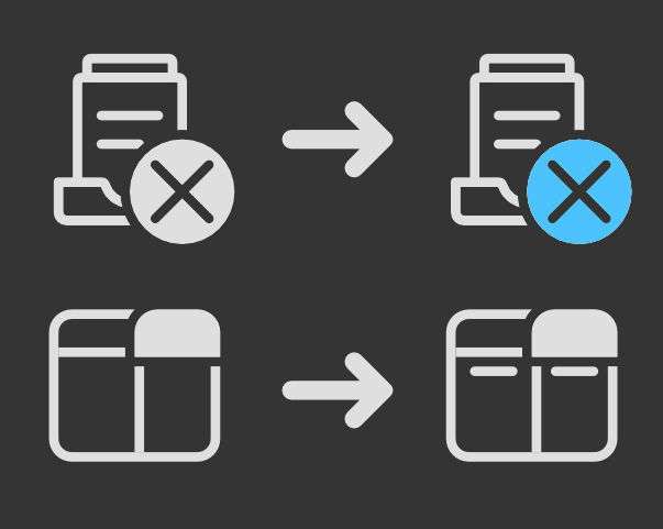
Updated the first post (03-01-2024). Fixed some sub-icon colors not displaying correctly for dual tone color icon sets, and fixed some missing icon elements.
I love this icon set. I would love to be able to create my own icons in the same style for custom buttons but I have real trouble getting them pixel perfect the way you have done (I have Illustrator and PS). Even when the exported .png looks clean it gets slightly altered (e.g. aliasing on the straight edges) when assigning the image to a button in Dopus.