Folder Tab Bar - when vertical - make as a separate, movable pane in the lister

Thanks very much for a great tool; I couldn't live without it. I'll write a book about (knowledge) Tree Walking one day, because that's what's going on.

I use the folder tab bar as a set of shortcuts to quickly zoom into top level sections, and keep them as a separate workspace. It currently has 8 tabs, which means its too long to put horizontally (consumes too much screen real estate) so I put it vertically.

Now, when I look at it, it looks wrong. The folder tabs are effectively a higher-level index of favourite paths into the folder tree. Well, we're proceeding from left to right, major to minor, so the Folder Tree Pane has it's child, the File Pane on it's right. Then the File Pane has its child, the viewer Pane, on its right.

The Folder Tree Pane is now really a child/derivation of my vertical Folder Tab Bar, but it is on the left of that Folder Tab Bar, when it should be on it's right.

This corroborates a feeling I had from the beginning, that I wanted my favourite locations, as tabs, and as the top level of the knowledge / directory hierarchy (i.e. in the leftmost position).

I know I could make favourites in the folder tree, but it's not the same. You need separate workspaces that remember all their state and do not interfere with each other. And you need nice clear tabs, that key into those separate workspaces.

I know it's a big change, and it will kick up a load of ancillary issues, but the closer you get to the underlying structure of a system, the better everything gets. In other words, I suspect this change, if implemented, will reveal other information structures and properties we haven't noticed yet.
Sorry to disagree :slight_smile:
What you are exposing here is YOUR view of how you like to use folder tree, tabs, file pane and viewer pane.
I do not share that view at all : most of my layouts do not even show the folder tree, as they have all the required tabs for the workflow they are designed to address opened (single pane for some layouts, dual pane for most of them), and some have 15+ tabs opened by default, the viewer pane is closed most of the time (even if I have a button to toggle it on and off), etc ...
Having the opened tabs on the left is not getting closer to the underlying structure of a system as the system does not start by the specific folders you are working with at a desired time.
To be clear, I'm not saying you should change the way you operate : do what feels right to you. And I'm not saying my way is the way neither. My point is we all have preferred ways depending on our workflows and approach to them.

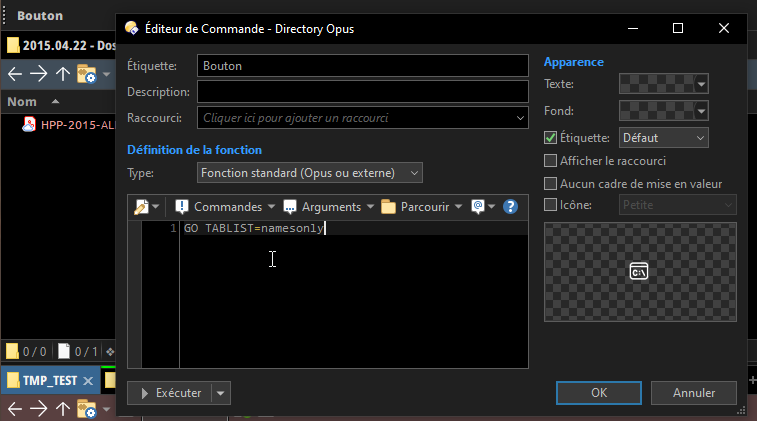
Nevertheless, there might be something that you can do : make a toolbar with GO TABLIST=namesonly that you put on the left of the folder tree. It will display the names (e.g. the folder name) of every opened tab in the active file display. You will not get fancy tab coloring though.
If your tabs are mainly static, you could also make a custom toolbar with "shortcuts" to your predefined tabs (with GO commands pointing to your standard/favorites folders), but it won't be dynamic (meaning, if you change the folder in one of the tabs, this will not follow along, whereas the GO TABLIST will).

And for the possibility of a new option for the location of the tabs, I will let GPSoftware team answer, since in the end, if I can keep it where it is now, it's fine for me.

1 Like

So you have a tab group that begins as default with 8 tabs ?
Or is this the Favorites Bar ?
What doesn't make sense is putting all tabs left of the tree when there are dual file displays.

Are you asking that there be something transcended above what is now offered default as the Favorites Bar that has properties and features similar to tabs, but also exclusive from what we now know as tabs, so that they operate independently as a kind of Tab Toolbar of Favorites ?

Well, it is a good thought. It got me thinking a bit.

Thanks for waiting.

The Favourites Bar would give me exactly what I wanted, if it also did the two things I mentioned in my initial spiel, i.e.

  1. Clicking on a Favourite opens a new workspace if not already present, (otherwise goes to the existing one)
  2. Each workspace remembers its entire state when focus passes to another Favourite.

I tried putting the Favourites Bar vertically, on the far left of DO, and it was the 'look' I was looking for, but it does not behave in the same way as the Tab Bar. Just a small word like 'stateful' is the difference between life and death in the IT world!

As for when there are dual file displays, well, we will have to be careful. I don't often use dual displays, but I've used them in the past in many other varients (like Norton Commander, etc). In general, in IT, we have some kind of a rule that defines how a UI object Q of number one can be duplicated - so maybe toolbar X stays common, but toolbar Y is doubled up and appears as Y1 on Q1 and Y2 on Q2. If our original object Q is structurally sound, this process should not cause inconsistencies. I hope the same principle would apply here. The final result may need tweaking a bit to make it look right, but I'm sure it's possible.

OK, I made a new toolbar. And I made a custom command "GO TABLIST=namesonly". I then dragged that command to the new toolbar and of course it doesn't work because I don't want it as a button. Please tell me how I assign that command to be executed in the toolbar.

I don't get the part about making a new command.
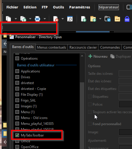
If you made a new toolbar, and it is visible like this :

Now just make a new button by right-clicking the toolbar :
image

Then right-click that button to edit it. Make it a Standard function (Opus or External), and put the command into it :

Quit Customize mode, and the button transforms into the list of the active lister tabs :

Now you can re-enter customize mode (Settings/Customize) to drag and drop the toolbar to the left edge and quit customize mode again :

Beautiful! Thankyou so much :pray: I changed the font size and colour and made it bold, and it looks great. It would be nice to have divider lines between the tabs, but hey, it's good enough for me :partying_face:

It's the mark of great design that it can be repurposed in ways the original designer never envisioned. I've found this with interior design, tools, and all sorts of things apart from software :slightly_smiling_face:

It would take many words to cover the many points raised here, so I'll try be brief.
(1) Yes, I am giving my view. I'm not here like a lawyer or political representative to advocate on behalf of someone else. Then having given my view, I ramble on about underlying structure because the majority of my comments get ignored everywhere online, so I try to give some reasons ONLY to show that I'm not a total madman to be ignored, but that there may be some reasoning in my madness.

(4) This is exactly true, because the "underlying structure of the system"(x) is root storage on the PC plus any remote storage areas one is connected to. However, every professional has a different frame by which they view the world. Physicians see it one way, Police another, Lawyers another, Politicians another way. A Physician may see you as pre-diabetic, the Police may see you as law abiding middle class, the lawyer may see you as someone who can afford his fees, and the politician may see you as a vote. The underlying structure of the way I'm managing knowledge (x1) , cuts through the underlying physical structure (x) in the way I described. It just takes more words to qualify the what I said properly.

(2) Yes, it's possible to do away with the folder tree. But having the two areas (Folder Tree and Files area) makes it possible to use the former to (a) remind yourself where you are, and use the latter to (b) define and localise the current work area of interest.
(a) is important because it's easy to get lost or forget where you are in a deep and wide tree.
(b) is important because it allows you to cut out the stuff you aren't currently interested in, and focus on what matters. This really helps when you have multiple tabs, because each tab remembers it's state, so it's possible to compare, contrast and connect information between different focused areas.
What is really good about Dopus is it allows you to expand folders as well in this area. This really confused me at first, because many other directory browsers make you do this in 2 separate panels. They make you be looking at a directory tree in one panel, and be looking at a flat file list in the other (that file list may include directories, but they cannot be expanded in that panel).
The beauty of Dopus is that it is non-judgmental in this area. It gives the user what appear to be unnecessary extra capabilities, but, on closer examination, those capabilities are both useful and powerful.

(3) Yes! I also have the viewer pane toggled, actually by a mouse key. The viewer pane sold me on buying Dopus; it makes my work so much easier. In fact, my next purchase will be a 40inch monitor, because Dopus with the viewer pane takes up a lot of screen real estate - but it's totally worth it.

(5) Great! I totally agree :slightly_smiling_face: :+1:

1 Like