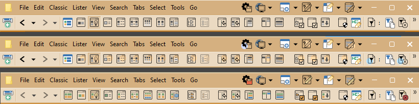
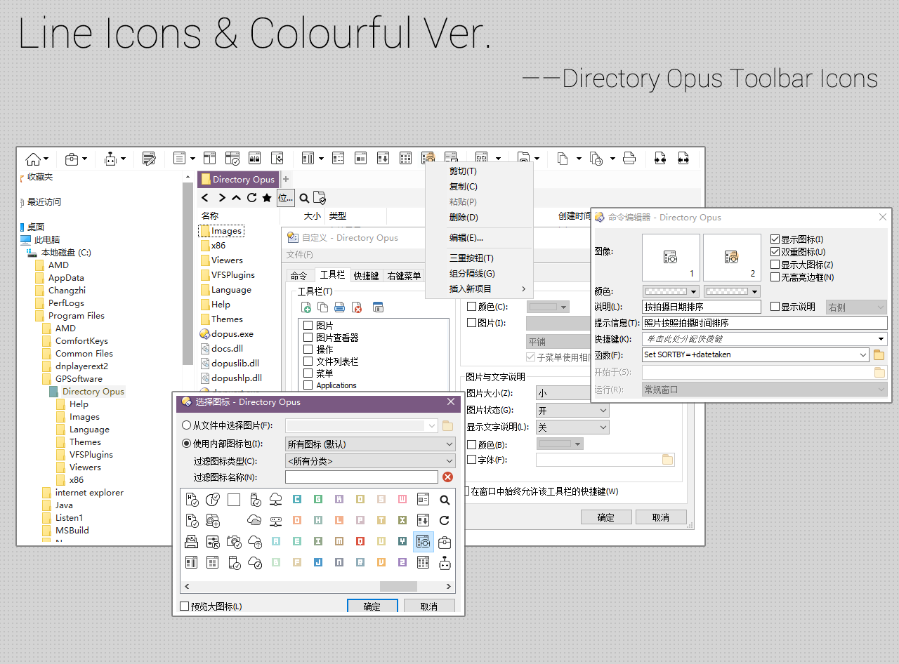
I took the liberty of adapting the Colourful version of these to the default Directory Opus 12 Menu toolbar.
The Colourful Line Icons appear as a hovered dual image.
A few of the internal dopus icons were changed to better match, but only a few.
I really love the elegant design of these icons. They remind me of painted images on script. I will be replacing the Opus 13 internal flat icons with these on my personal rig. To get there I have already started to convert all the flat aeIcons I built for Opus 12 and 13, that should end up being 300+ additional icons.
The top line are the default Line Icons by the author (minimal colour).
The line below is the colour version.
I am a bit old-school and need more visual colour-cues i.e. from the Opus internal flat icons to help me orientate a bit better in the interface.
So I recoloured the author’s first row icons into those shown in the 3rd row. I will very likely tone down the colours in the (x) and the disk icon using 50% transparency on those backfilled colours to make them look more subdued.
Question to author: Are you OK if I release your icons in my re-coloured style as an Opus icon set, adding 300+ additional icons using your style?
It has been quite a few years, but I cannot release my version of the icon set without permission, IMO. So hopefully the author is still out there…
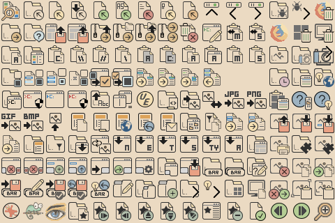
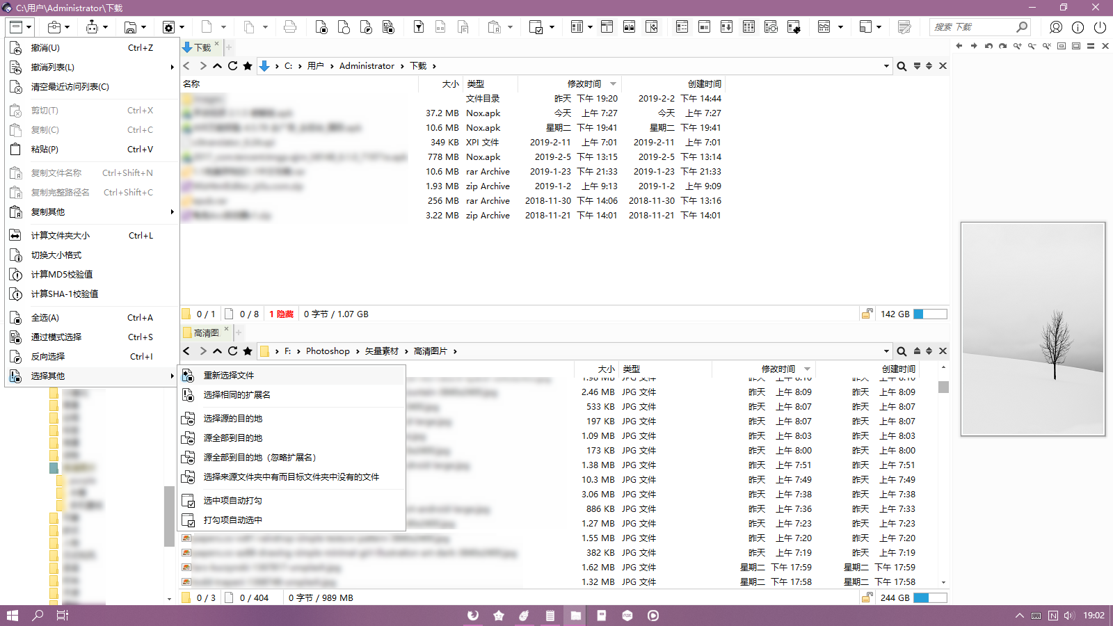
It took me a while to create the extra 324 icons in the Line Icons style, recoloured in a style reminiscent of Opus’ Internal Icon Set (Flat). So, the 32x32 are done, still have to do all the 22x22 icons though. To give anyone interested a better idea of how this presently looks, here are a few of the icons:
Tip: Right-click on the image and “Save image as…” to then look at the image via Opus. For some reason Firefox and the images in this forum always end up looking blurry on my PC.
Update: I only just noted that the icon set screenshot was taken at 200% of the original icon image size. The actual icons are “finer”. I updated the screenshot to 1:1 scale above.
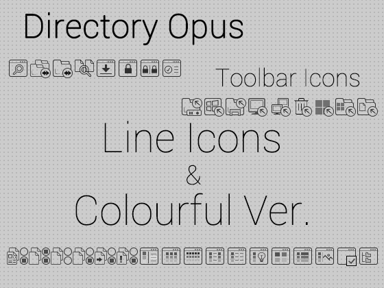
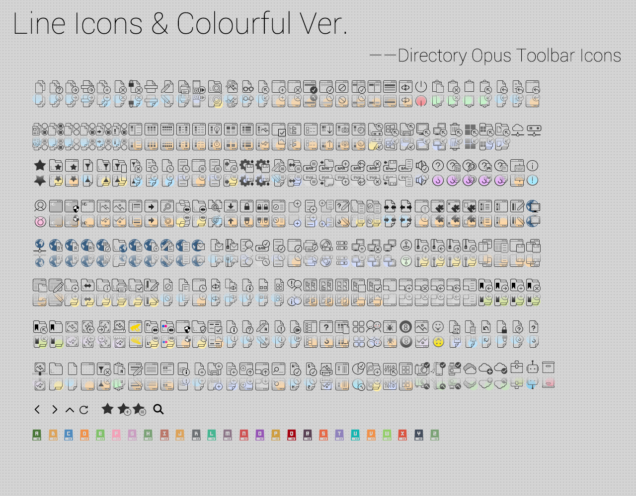






 Thank you.