Loved the colors and clean look of CCleaner, so why not copy it  As close as I could get. Some options are just not available to adjust

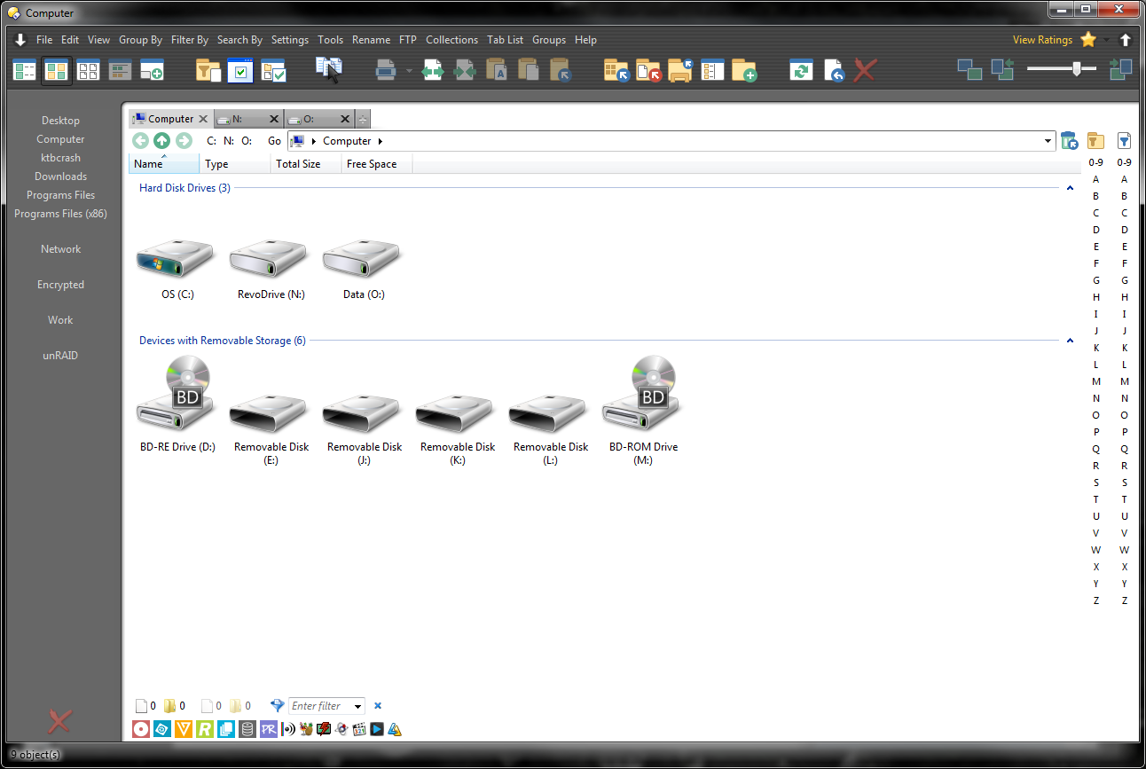
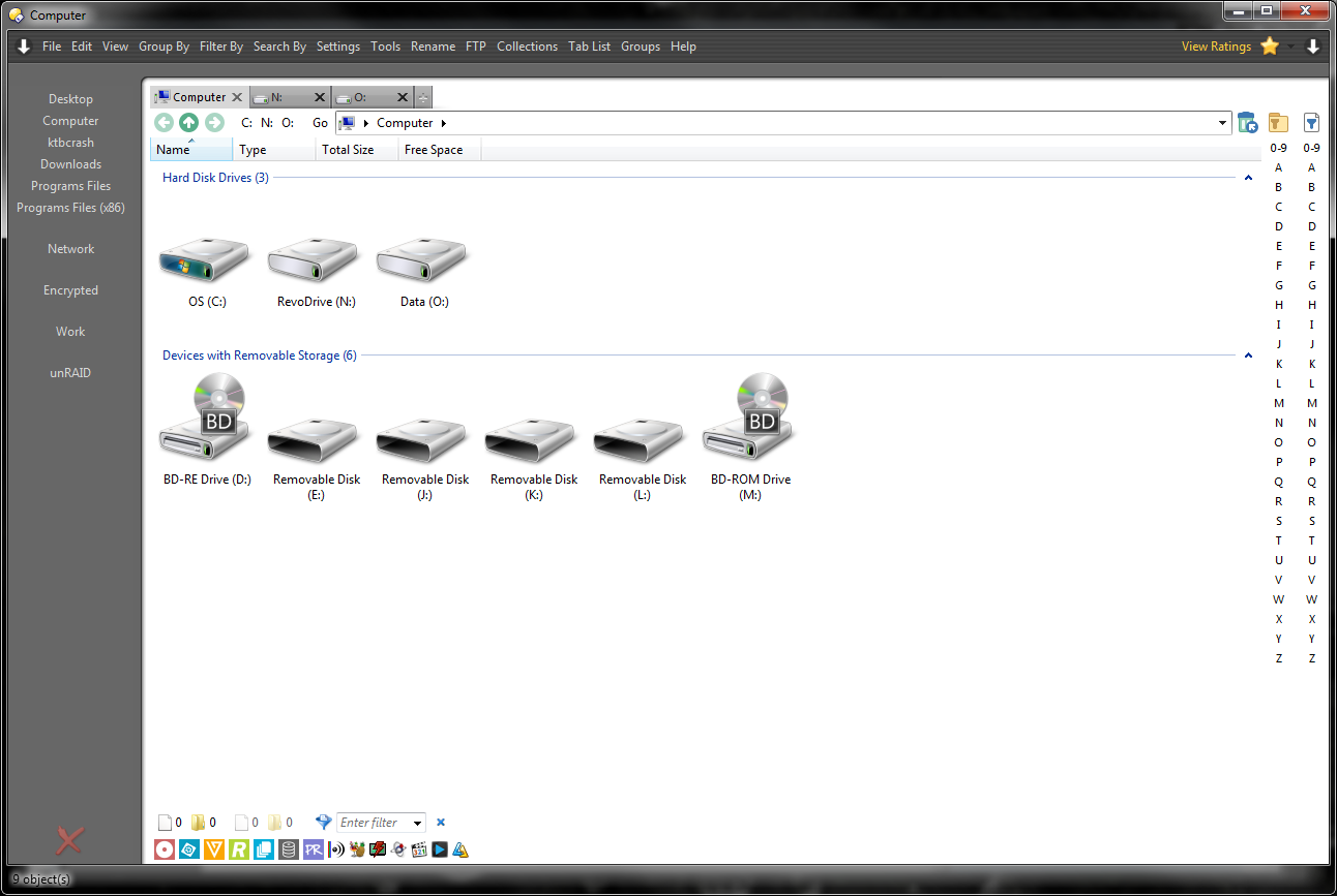
Just realized how old my first screenshot was. Here's my updated version. Updated it when v11 came out.
Top/Right arrow toggles my command toolbar for a cleaner look:
Top/Left arrow toggles the default toolbars to look up any stock commands:

how did you do the leftside list? looks great
Thanks. What part do you mean?
Those are just buttons that point to folders on a vertical toolbar with spacers. Like:
Go "C:\Folder Name"It's not dynamically built. Actually, those buttons are three-button buttons. Left-click opens in current tab, Right-click opens in new tab
If you are talking about the graphics and how the toolbars mesh, I would need some time to demonstrate how I did that.
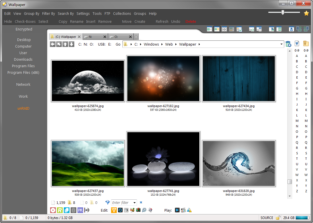
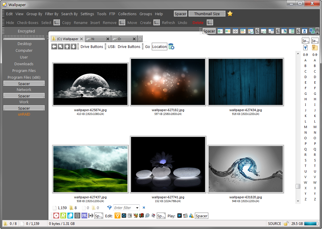
Here is my latest version. I wanted to clean it up even more so I decided to go with all text for menus and commands. All the commands are drop-downs except for 'check-boxes' & 'refresh'
My new design is also more dynamic for the width of the buttons. Before, it was a lot harder to just add more buttons. IDK, I like it. It's served me well
Really like the latest version! Definitely interested in how you graphically set it up.
Thanks, Chuck. Here you go. I hope this makes sense and helps.
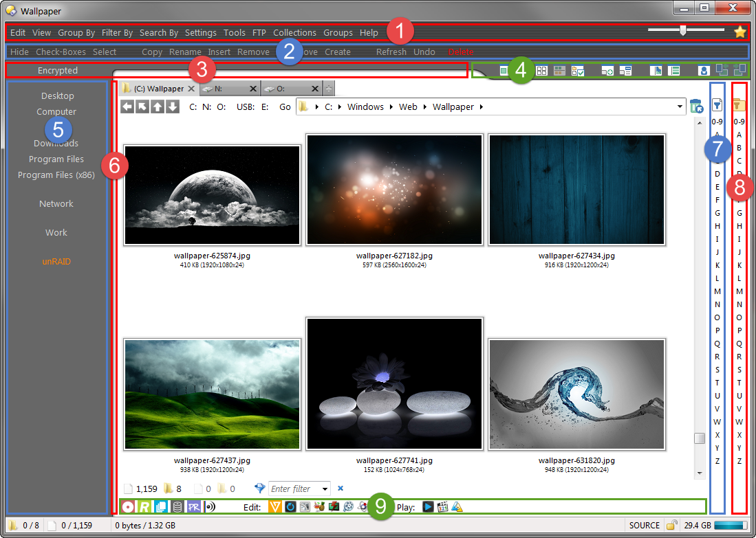
#1 and #2 you would think share the same graphic, but they don't. Depending on how tall #1 is, dictates which graphic #2 uses. 1st graphic starts with the dark line first. The 2nd graphic starts with the light line. In my screenshot, #2 toolbar needed the graphic to start with light line on top so it meshed correctly. #1 has a full width spacer to push the thumbnail slider and ratings button to the right.
#3 is the most non-dynamic of them all. The button has spaces added before and after the buttons name to help center it with the buttons in #5. I created 151 different graphics for #3, each version 1 pixel shifted to the right so the curve matches #6. It ranges from 20 - 170 (pixels from left edge). This screenshot I'm currently using graphic 155. If I add a button in toolbar #5 that is wider than the widest button (example: "Program Files (x86)"), I need to change the graphic used in #3 so it lines up with #6.
#4 has it's own graphic with a spacer before the buttons. The spacer helps push the buttons away from the graphics curve. Thanks to Jon and Leo for giving toolbar dividers the option to be transparent. If I change the width of my dopus window, #4 needs to be re-adjusted so the icons align to the right edge. Or the spacer can be set to 'full width' and it auto pushes the icons to the right edge. But the divider still needs adjusting.
#5 has nothing special for graphics, It's just a solid color. It has spacers to help create groups. there is a smaller spacer above Desktop to help create the illusion that "Encrypted" is part of the same toolbar.
#6 has a graphic that creates the vertical seperator. It also has a hidden button with no name. This helped shrink the toolbar to it's smallest size. I can add spaces to the buttons name to adjust how close the main lister window/tabs sit to #6 (current screenshot has a button with zero spaces).
#7 and #8 just have spacers up top to help push the starting icons down so they are level with the recycling bin. Now that I'm closely looking at it, I might be a pixel off
#9 has nothing special going on. It's just white so it blends with the filter bar and the main lister content.
Here is the same window in customize mode if that helps see what's what.
1 Like
It won't simplify things much, given all the rest, but you could make #1 & #2 use a single background image by using a shared-tiled image for them.
Shared images have their origin set to the top-left of the window, rather than the top-left of the toolbar as with a normal image.
Same thing that lets this very old screenshot work by using just two versions of the image (one tinted green, one blue):
Thanks, Leo.
At first, I was lost. Setting it to share just stretched my image. Then I found the option under Preferences / Display / Images. Select the image and pick tiled from the When image is shared drop-down.
Works good. saves from having to maintain two images I guess 
I now also want my menus to have a kitty. Thanks ;p
so what are # 7 and 8 uesed for ?
Those are just quick filters. #7 acts on files only, #8 acts on folders only. Kind of the lazy mans way of doing quick filtering. If I click on #7 'C', only files that begin with 'c' will show up.
The toolbars are posted here somewhere.
nice now i need to find then 
Found it.
Thanks for the insight ktbcrash! I definitely appreciate the thought and work that went into it... Truly inspiring!
You indicate some graphics are dependent on others' sizes. Is this automated, or do you manually adjust as needed?
If automated, did you use a script of some sort? I would definitely be interested in how it works under the hood.
Cheers!
Manually adjust as needed.
With Leo's method, I can now just use one graphic for both #1 & #2's toolbars.
Any graphic I made that needed to be a dynamic width, I just made 4000 pixels wide. That way it covered a full UHD width (even though I never go full screen with my dopus). So #3 an #4 have really wide graphics.
#5 is just a solid color and it's width just pushes #6.
Makes sense. I'm going to mess with something somewhat similar this weekend and see how it turns out.