Status Bar codes

This post collects my status bar codes from over the years, and the rest of the thread has other people's.

If you like the screenshots, just copy and paste the codes (from the text files) into Preferences / Display / Status Bar.

(I've put the codes in text files, instead of in the post directly, because they sometimes use spaces at the start or end of lines to add some extra padding, and those often get trimmed by the forum software.)

Notes:

  • Codes designed for earlier versions of Opus will work on later versions, but going the other way around won't always work.

  • Some of the screenshots use the glass status bar, others don't. That is configured via Preferences / Display / Options / Show glass status bar (Vista/Win7 only), and is not affected by the status bar codes themselves. This is largely irrelevant in Windows 8 and 10, as they broke the glass support which had only just been added in Vista and Win7. (Win10 then introduced a new but completely different type of glass, but it's not the same thing.)

  • Some of my codes don't include the Format Lock. (I've gone through phases of using a menu for it to save space on the status bar and/or make the dual status bar more symmetric.) If you want it back, add {fl} where you want it.

Directory Opus 11, 12, and above:

  • The Preferences editor has a good set of presets for you to choose from there. You probably have no reason to be looking at this post at all. Check out what's in the program itself for different options, some similar to what is shown below.

  • Also note that in Opus 12, you usually only need the "Single" codes people have shared. Opus 12 added the ability to use the "Single"-sided codes for individual status bars on both sides of the lister, removing the need to separately define what happens when in dual-display modes.


Directory Opus 10:


Directory Opus 9 (codes optimized for glass):


Directory Opus 9 (codes not optimized for glass):


Directory Opus 8 (compact version):


Directory Opus 8 (older version):

Here's my statusbar codes.

A couple of things worth mentioning:

  • Hidden file/folders are shown in RED (the number only shows when there are actually hidden files in the current lister.

  • The three small bar graphs (two on top, one below) are setup to show the size of selected files/folders. Each graph is set to a different maximum size, allowing me to see at a glance whether the selected files will fit on a blank CD, my USB Key (badly in need of an update - it's only 64Mb :slight_smile: ), or a blank DVD. Once the price of media drops I plan to add a fourth bar to the cluster to show Dual/Double DVD's. Each of the graphs turns red once the selected files are too big to fit - very handy.
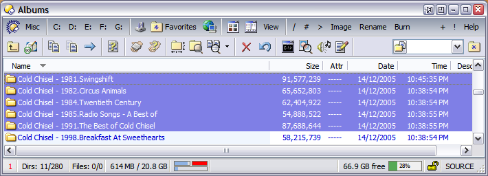
  • The bar graph on the far right is simply an indication of space used on the current drive.

Everything else should be self-explanatory. I don't use a separate dual display status bar. I find it more intuitive to just use the single one as I change between horizontal and vertical dual displays to suit the task at hand.

Update 27th Dec 2006:

  • By request, a dual-display version of this status bar has been added.
  • Small change to the single-display version so that the "hidden items" panel is not shown at all if there are no hidden items.

tanis-status.txt (303 Bytes)


tanis-status-dual.txt (622 Bytes)

I have combined the good stuff from both status bars (nudel, tanis) and made the change that the bottom bar of the small bars doesn't use 4.5 GB but instead uses the free space in destination as the maximum value. Becomes very handy when copying files from one drive to another because you instantly see if it fits in the destination.

See attached files.


bens_statusbar.txt (1.16 KB)

Here's how:

Add {wtree} (on a line by itself) to the top of both the single and dual status bars.

In the dual status bar, also add {wtree2} (on a line by itself) directly before the first right-hand-side item (in the case of my status bars, that's the line with {hiR} hidden; not sure if Steve's are the same).

Seems like waste of space to display nothing under the folder tree portion, but it's your choice.

I really appreciate everyone posting their toolbars, and have always tinkered with snippets from various toolbars posted. for what it's worth here is my latest mod:

<#666666>o)){h!} <#ff0000>hid : {hi} </#>{h!}<#666666><b> [dir]</b> s-<#0033FF> {sd}/{td}<#666666> -t :: <b>[ file]</b> s- <#0033FF>{sf}/{tf}<#666666> -t ::[[  s- <#009900><b>{sba}</b><#666666>  / <b><#009900>{tba}</b><#666666> -t{h!} :: <#009900><i>{sbda} <#666666> in folder(s)</i>{h!} <#666666> ]]:: ((o
{bg+v=sb/250m,c=#00CC00,c3=#FF0000, w=24, f=2,l=0}{bg+v=sb/4.5g,c=#993399,c3=#FF0000, w=24, f=2,l=1}{bg+v=sb/80m,c=#FF9900,c3=#FF0000, w=25, f=2,l=1}{bg+v=sb/700m,c=#0099CC,c3=#FF0000, w=25, f=2,l=0} <#666666>: <#FF9900>au.cd <#666666>:<#00CC00> usb <#666666>: <#0099CC>cd <#666666>: <#993399>dvd <#666666>: {rpad}
<#666666>o)) <#0033FF>{df} free {bg+f=2,w=50,g=0,c=#55aa55,b=#f0f0f0,c2=#f06840,g=0}<#666666> ((o 

it's not dual status as I never use that, and feel free to tidy or tinker with it how you may. I like using text/ascii graphics and use them where appropriate to distinguish different values ( harkens back to teknap scripting days )

I actually display all hidden items, so that's added for anyone who dosn't, and I found that when selecting mix files and folders, having a rough idea of the amount which is in the folders was useful, it's hidden by default and displayed in italics if appropriate (found out by calculate folder size button, or hover over folder to determine size if that's switched on )
the bar graphs are not mine, I borrowed them directly nudel and tanis and made some cosmetic changes. thanks again for your expertise and info on these matters!

Using the Codes button/menu I looked up the two codes required:

  • {sb} shows the selected bytes in the source.

  • {dfDb} shows the number of bytes free in the destination.

On their own they'll just show some numbers. Now to combine them into a bar graph:

{bg+v=sb/dfDb,w=50,f=2,b=#f0f0f0,c1=#68f040,c2=#f06840,g=0}

That creates a bar graph showing how much, as a percentage, the selected items will fill up the destination's free space.

The important part is v=sb/dfDb, the rest is just there to define the width, height and colours of the graph.

I don't think you can do that. You can hide empty sections of the status bar, but I don't think this example qualifies. You can set the left and right sides to each show how much their selections will fill up the opposite side, though.

I updated my toolbar with the new icon and some other tweaks after getting a better grasp on the bar graphs. as before it's not configured for dual display and I show hidden items by default. The 'drive' icon is lifted out of shell32.dll and saved as a seperate icon in the Opus directory. This is a snap of selecting some video clips for cobbling together onto dvds. The selected/total duration for media files would be hidden if not applicable. All of this is modified goodness from what's been shared here, thanks again.

<#666666>o)){h!} <#ff0000>hid : {hi} </#>{h!}<#666666><b> {i:dir}</b> <#0033FF> {sd}/{td}<#666666> :: <b>{i:.txt}</b>  <#0033FF>{sf}/{tf}<#666666> ::[[  <#009900><b>{sba}</b><#666666>  / <b><#009900>{tba}</b><#666666>{h!} :: <#009900><i>{sbda}<#666666> in folder(s)</i>{h!} <#666666>{h!}:: {i:.avi} <#9900FF>{smp3} / {tmp3}{h!}<#666666> ]]:: ((o{rpad}
<#666666>::{i:C:\Bin\Shell\Opus\drive.ico} {dlet} / <#999999>{dlab}<#666666> ::
:: {bg+v=sb/80m,c1=#FF9900,c2=#FFCC33,c3=#FF0000, w=24, f=2,l=0}{bg+v=sb/250m,c1=#00CC00,c2=#FFCC33,c3=#FF0000, w=24, f=2,l=1}{bg+v=sb/700m,c1=#0099CC,c2=#FFCC33, c3=#FF0000, w=24, f=2,l=0}{bg+v=sb/4.2g,c1=#993399,c2=#FFCC33,c3=#FF0000, w=24, f=2,l=1} <#666666>: <#FF9900>au.cd <#666666>:<#00CC00> usb <#666666>: <#0099CC>cd <#666666>: <#993399>dvd <#666666>::
<#666666>o)) <#0033FF>{df} free {bg+f=2,w=50,c1=#55aa55,b=#ffffff,c2=#f06840,g=2}<#666666> ((o

My Status Bar

Directory Opus 9 Status Bar Single

{h!} <b><#FF0000>{hi} Nascosti</#></b> {h!}
 {i:dir} Selezionate {sd} Di {td} Cartelle 
 Selezionati {sf} Di {tf} Files 
 {sba} / {tba} 
 {bg+v=sb/695m,c=#8eb2e4,c3=#FF0000,w=50,f=2,l=0}{bg+v=sb/4438.6m,c=#8eb2e4,c3=#FF0000,w=75,f=2,l=1}  
{rpad}
{h!} {du} Occupati / {df} Liberi  {bg+w=100,f=2,b=#f0f0f0,c1=#00ff00,c2=#ff0000,g=2} {h!}
{fl}
{ls}

Directory Opus 9 Status Bar Dual

{h!L} <b><#FF0000>{hiL} Nascosti</#></b> {h!L}
 {i:dir} Selezionate {sdL} Di {tdL} Cartelle 
 Selezionati {sfL} Di {tfL} Files 
 {sbaL} / {tbaL}
 {h!L} {duL} Occupati / {dfL} Liberi {bg+v=puL/100,f=2,b=#f0f0f0,c1=#00ff00,c2=#ff0000,w=100,g=2} {h!L}{rleft-}
{h!R} <b><#FF0000>{hiR} Nascosti</#></b> {h!R}
 {i:dir} Selezionate {sdR} Di {tdR} Cartelle 
 Selezionati {sfR} Di {tfR} Files 
 {sbaR} / {tbaR} {rpad}
 {h!R} {duR} Occupati / {dfR} Liberi {bg+v=puR/100,f=2,b=#f0f0f0,c1=#00ff00,c2=#ff0000,w=100,g=2} {h!R}

right-click on your status bar and choose the [edit status bar] option. A Preferences window will open up. Then copy-paste the contents of the .txt files on the forum into the Preferences window.

Hey i created a status bar "theme" based on leo's code.

The displayed information are the same but they are only shown when present, that keeps the sb clean but also informative in certain situations. Also i added icons for the size and playtime (please note that your zip and mp3 file icons are used) and adjusted the view style.

The upper bar on the screenshot shows the singel view. You can see the number of subfolders, files and total size. No selection is made.

The lower bar shows the dual view. On the left you can see an active filter that hiddes 7 out of 9 files in the left-hand display. Note as the display contains no subfolders, no folder information are shown.
The right area displays info about the right-hand display. It shows the appropriate file size and playtime for one selected mp3 file out of 14 and of course the total number of files, size and playtime.

Hope you like it.
littlex-singel-sb.txt (337 Bytes)
littlex-dual-sb.txt (745 Bytes)

Here's mine!

Explanation:

  1. The bars left show 700 CD-R, 2GB, and 4,5GB DVD-R
  2. All values are "<selected> / <total>"
  3. Hidden files are shown with a red "+" next to total files

Single

{bg+v=sb/700m,c=#e99f00,c3=#770000,w=20, f=2,l=0}{bg+v=sb/2g,c=#e99f00,c3=#770000,w=35, f=2,l=0}{bg+v=sb/4.5g,c=#e99f00,c3=#770000,w=56, f=2,l=1}
{i:dir} {sd}/{td} 
{i:txt} {sf}/{tf}{h!}<#841e1e>+{hi}</#></b>{h!} 
{sba} / {tba} 
{h!} {i:.mp3} {smp3} / {tmp3} {h!}{rpad} 
{h!} {df} von {dt} frei {bg+w=150,f=2,b=#f5f5f5,c1=#bcdafc,c2=#7eb9fc,g=2}{h!}
{fl}
{ls}

Dual

{bg+v=sb/700m,c=#e99f00,c3=#770000,w=20, f=2,l=0}{bg+v=sb/2g,c=#e99f00,c3=#770000,w=35, f=2,l=0}{bg+v=sb/4.5g,c=#e99f00,c3=#770000,w=56, f=2,l=1}
{i:dir} {sdL}/{tdL} 
{i:txt} {sfL}/{tfL}{h!L}<#841e1e>+{hiL}</#></b>{h!L} 
{sbaL} / {tbaL} 
{h!}{i:.mp3} {smp3L} / {tmp3L}{h!} 
{h!L}{dfL} von {dtL} frei {bgL+w=125,f=2,b=#f5f5f5,c1=#ffca76,c2=#ff9c00f,g=2} {h!L}{rleft-}
{i:dir} {sdR}/{tdR} 
{i:txt} {sfR}/{tfR}{h!R}<#841e1e>+{hiR}</#></b>{h!R} 
{sbaR} / {tbaR} 
{h!}{i:.mp3} {smp3R} / {tmp3R}{h!}{rpad} 
{dfR} von {dtR} frei {bgR+w=125,f=2,b=#f5f5f5,c1=#ffca76,c2=#ff9c00,g=2} {h!R}
{fl}
{ls}

(Question/answer/reply have been edited down into a single post to tidy the thread up.)

When using the glas effect, the contrast could be a bit better for the green text, see screenshot. Which values
have to be tweaked? I tried changing a couple of those hex numbers, but no color change occured.


{h!L} <#ff0000> {hiL} </#>{h!L}
{h!L} {smp3L} /{h!L}{h!L} {tmp3L} {h!L} 
 {i:dir} {sdL}/{tdL}
{i:.txt} {sfL}/{tfL}
 {sbLa} von {tbLa}
{bg+v=sbL/4.7g,c=#8eb2e4,c1=#32cd32,c2=#FF0000,c3=#FF0000,w=35,f=4,l=0,g=2}{bg+v=sbL/8.0g,c=#8eb2e4,c1=#32cd32,c2=#FF0000,c3=#FF0000,w=35,f=4,l=0,g=2}{bg+v=sbL/15.0g,c=#8eb2e4,c1=#32cd32,c2=#FF0000,c3=#FF0000,w=71,f=4,l=1,g=2} {dfL} frei {bgL+f=4,w=50,g=0,c=#8eb2e4,c1=#32cd32,c2=#FF0000,c3=#FF0000,g=2} {rleft-}
{h!R} <#ff0000> {hiR} </#>{h!R}
{h!R} {smp3R} /{h!R}{h!R} {tmp3R} {h!R}
 {i:dir} {sdR}/{tdR}
{i:.txt} {sfR}/{tfR}
 {sbRa} von {tbRa} {rpad}
{bg+v=sbR/4.7g,c=#8eb2e4,c1=#32cd32,c2=#FF0000,c3=#FF0000,w=35,f=4,l=0,g=2}{bg+v=sbR/8.0g,c=#8eb2e4,c1=#32cd32,c2=#FF0000,c3=#FF0000,w=35,f=4,l=0,g=2}{bg+v=sbR/15.0g,c=#8eb2e4,c1=#32cd32,c2=#FF0000,c3=#FF0000,w=71,f=4,l=1,g=2} {dfR} frei {bgR+f=4,w=50,g=0,c=#8eb2e4,c1=#32cd32,c2=#FF0000,c3=#FF0000,g=2}
 {gfl}

Yes, that´s already better, thanks.

Can someone do a translation of this status bar? Much will appreciated.
Thank You.

There are only about seven words to translate there, most of them fairly obvious from the context, especially if you cross-reference them to the status codes they are next to (which are the same in all languages).

Google Translate or Bing Translator should be able to clarify any remaining words if you still can't work them out.

Hi,

Most status bar examples here and in other talks are showing bar graph for free disk as a percent of free space on disk.
With this setting, the more free space you have on your disk, the more visually full the bar looks like.
It's a bit strange for me because I would prefer to have a 'full bar' rather when my disk tends to be full and not free.
At first try I've changed bg+V=du/dt and inverted foreground / background color for bar graph (foreground is grey and background is colored), so that bar graph is full when your disk is full and bar graph is empty when your disk is empty.
But it was not that nice because as my disk are often rather close to 20% free space, bar graph is 80% full and i feel it's always full and don't see much difference when it's 90% or 98% full.

My idea is more to show fullness when you reach for example last 10Gb of free space.
So I've tested different settings and found bg+V=1Gb/df was working fine for me as i compared free space on my disk to 1Gb.

  • if free space on disk is below 1Gb : bar graph is full (to indicate that my disk is full)
  • if 2Gb free : bar graph is 50% full
  • if 5Gb free : bar graph is 20% full
  • if 10Gb free : bar graph is 10% full
  • if 50Gb free : bar graph is 2% full (we just see a little color in the beginning of bar graph)

Of course this is working for me but you could change 1Gb to any other value that fits better for you.

Example 1 (50Gb free from a 500Gb HD) :
image

Example 2 (7,2 Gb free) :
image

Example 3 (700 Mo free) :
image

Code for this bar graph is :

{bg+V=1Gb/df,b=#EEEEEE,w=-1,f=3,g=0,t=n,c=#F28A35}

and complete code for my status (as in screenshot) :

{i:dir}  {sd} / {td}
{i:file}  {sf} / {tf}
{h!} <#FF0000><b>{hi} hidden</b></#> {h!}
{h!} <#008800><b>{hse}</b></#> {h!}
{bg+V=sb/tb,b=#EEEEEE,w=-1,f=3,g=0,t=n,c=#BBCCCC}<b>select {sba}</b> / total {tba}
{rpad}{ls}{fl}
{h!}{bg+V=1Gb/df,b=#EEEEEE,w=-1,f=3,g=0,t=n,c=#F28A35}Drive {df} free ({dlet})

cheers,
Antoine

1 Like

Would be cool if we could set thresholds using math, like the following.

{h!{{pf}<20}}{pf}% free{h!}