Configuring background images for toolbars and the file display can appear confusing at first but it's easy once you know what to do.
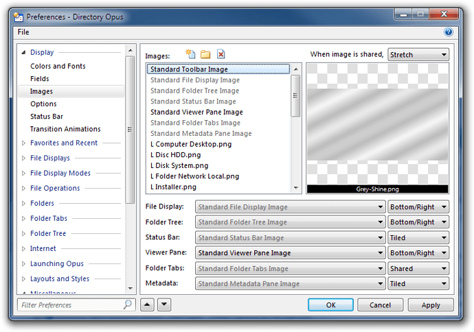
The page under Preferences, Display, Images has two sections that work together:
The top section (with the list and preview area) is what defines which images are available to be used throughout the program but it is the bottom section, with the six dropdowns, that actually defines which images get used by default. If you've defined Standard File Display Image at the top, don't forget to select the same thing in the File Display drop-down at the bottom.
Toolbar Images
Toolbar images can be different per toolbar and the setting in Preferences is just a default. Go to Customize mode and check that each of your toolbars has the image you want.
Folder Images
Directory Opus has a system that lets you define different background images for different folders and Folder Formats. Again, this means that the Images page in Preferences is just a set of defaults. While still in Preferences, go to the Folders, Folder Formats section and have a look at the formats defined there (double-click each format and look in the Options tab for the image setting):
- Default Formats, Custom is what will be used if nothing else overrides it. Check that first.
- Check the Content Type formats to see if anything is overriding a background image based on the types of files Opus finds. (e.g. You can have a musical background if there are lots of MP3s found in a directory, etc.)
- Check the other formats as applicable. See the separate FAQ on Folder Formats for more information.
Shared and Tiled Images
When you're defining images it's important to pay attention to the way you're telling Opus to display them. Some images are designed to be displayed in a corner of the window while others are designed to be stretched or tiled to fill their area. (Note that stretching can cause significant slowdown on some graphics cards.)
You can also set images to be shared across several elements. When you do this the Shared drop-down back at the top of the Preferences, Images dialog comes into play. The image will be stretched or tiled to fill the entire Opus window and then the elements, such as toolbars, file display areas, and so on, which are set to use the image in shared mode will have this pattern drawn as their background. This allows a single image to line-up between two adjacent parts of the lister.
The effect shown below is made from two different versions of the same image. One version has a blue tint while the other has a green tint. Both are set to be tiled when shared (to avoid their aspect ratio being ruined by stretching). The toolbars and menus are set to use the blue version of the image while the tree, file display and statusbar all use the green version.
We're not suggesting that you should actually configure Opus to look like this. This is just a demonstration of how the "shared" setting can be used to create backgrounds which span multiple parts of the window and still line up. Of course, if you want kitten jumping out of your menus then knock yourself out.
Blending
You can control the amount of blending, if any, that is done between file display background and selection colours and the background image via Preferences, Display, Options.

